Introduction
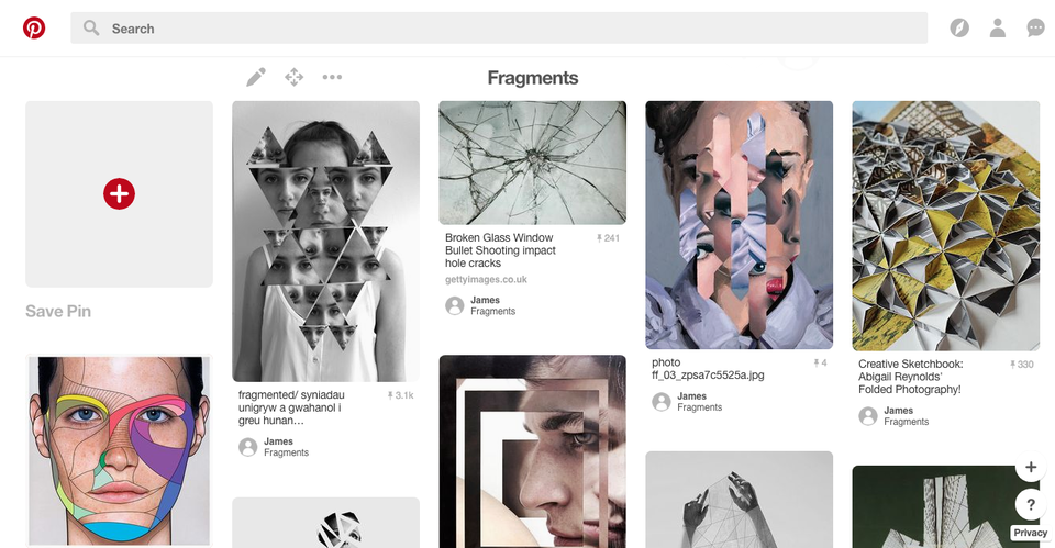
The fragments photography topic is about using fragments to make the photographs unique. If you look at the pictures that I have pinned on my fragments board on Pinterest, the pictures have been split into fragments in different ways that make it different to all the others. For example, the picture on the bottom left has been split into different parts and some of the fragments have been coloured vibrant colours. Another example of unique fragments photos is the top left one where the woman's face has put into triangles and placed over the photo. My favourite one of these examples isn't actually in the screenshot of the Pinterest board because it is further down the board but it's a photo of a women's reflection in a broken mirror so the photo is naturally in fragments from the mirror. The reason I chose to do the fragments topic is because I find it really interesting about the various ways of making fragments and taking pictures of them. I also think it will be a bit of a challenge to find natural fragments without having to change anything.
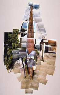
David Hockney
|
The reason I chose to research David Hockney is because when he takes photos he likes to split them up and make collages which is a way of showing fragments. I like this way of making collages/fragments because it's quite original and the only other people that do it the same way have taken inspiration from Hockney himself. Hockney doesn't really follow any rules for the composition because most of his photos are composed differently. Most of his photos are colours but some are in black and white. The photos that are in colour are usually bright but the black and white photos are quite dark. I really like the photos that he uses to make the collages because they are quite interesting because in all of them the subject is outside or doing something active. I also like how he uses just a plain background to place the collages because the colour of the background goes with the actual collage in all of the collages.
|
|
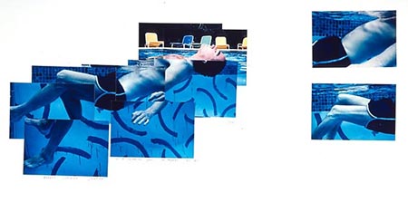
Detailed Photo Analysis (David Hockney)
|
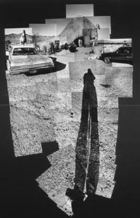
This collage by David Hockney is made up of 1 photo that has been cut into lots of pieces. The way he places the cut up pieces is weird because it's still all in the right places but they aren't that all connected properly so it makes it look really interesting. I also like how the colours within the photo get duller towards the edges and the brighter, more vibrant colours are more centred. The reason I like the way Hockney capture the colours is because it makes it look really natural. Some of the smaller images are at different angles to the image next to them and it makes it look like it shouldn't be like that but it makes it look really interesting.
|

|
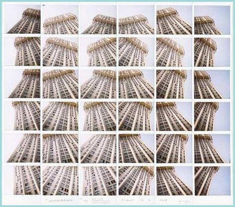
Maurizio Galimberti
|
I chose to do Maurizio Galimberti because I like the way he uses photos that are almost the same just in different position to make large collages. I like the way he makes his collages because no one else does it the same way. I also like the way that the the centre of the original image isn't always in the centre of the collages. Another thing I like about his work is that even though the photos aren't laid out perfectly next to each other you can still see what the collage is meant to be or what it's meant to look like.
|
|
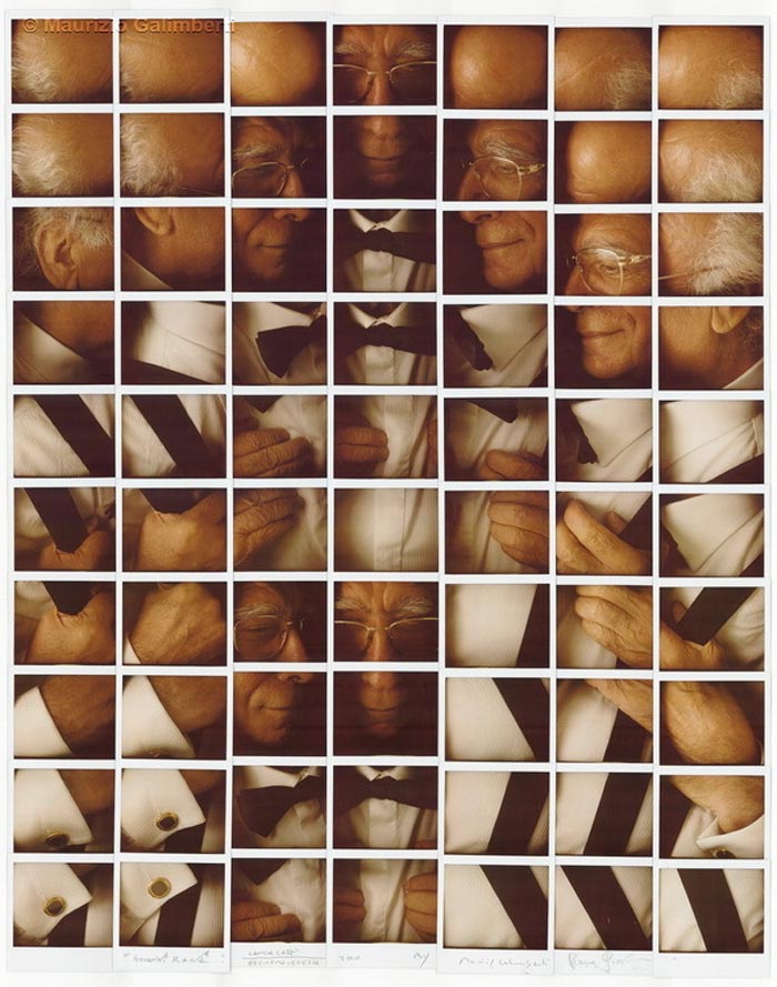
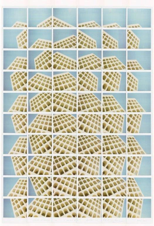
Detailed Photo Analysis (Maurizio Galimberti)
|
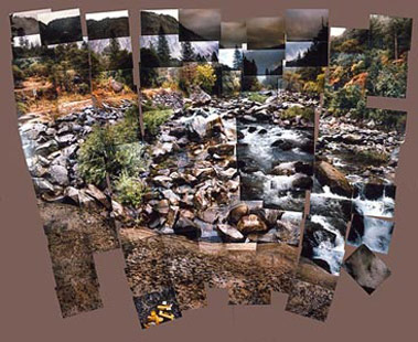
This photo by Maurizio Galimberti is a collage made up of 36 individual pictures that are slightly different each time. The way he changed the pictures is by taking them at different angles of different parts of the building. When he put them together to make the collage he put the pictures that had a lot of the building showing in the centre of the collage and the pictures with less building and more background on the edge of the collage. The colours in this photo are quite contrasting because the building has quite a dull, brown colour but the background is a bright blue colour. The way he captured the contrasting colours is interesting because light in each image is different so it makes the colours look lighter in some pictures but darker in the others. The most interesting thing about this collage is the way that there are no images next to each other that have the same sort of angle. I also really like how every picture is different.
|
|
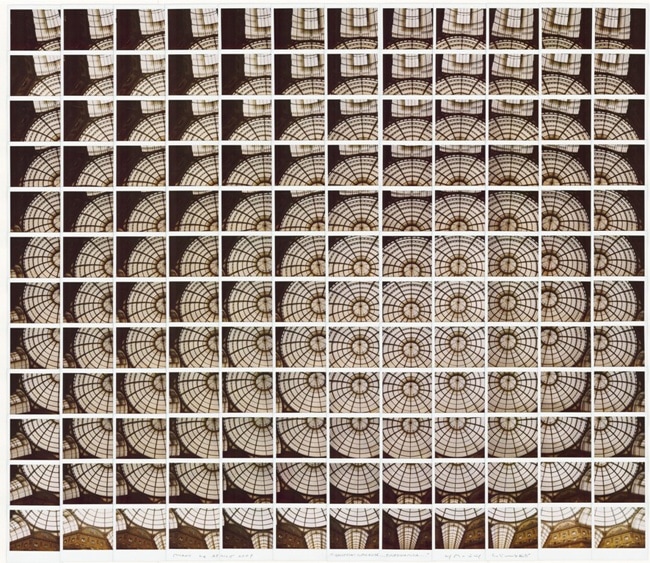
Lucas Simões
|
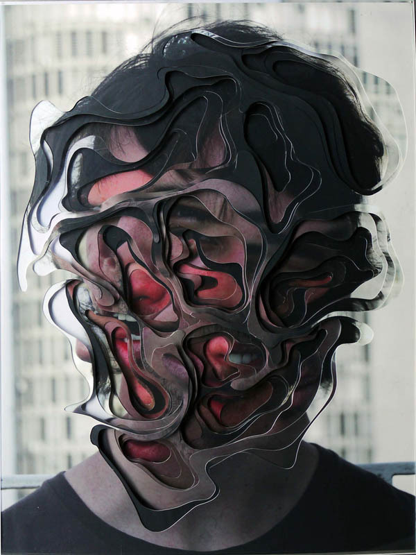
I chose to research Lucas Simões is because I like his style of taking and editing photos. I like the way he makes his photos look really distorted. The way he does this is by taking a photo of someones face and either smudging it or putting shapes over their faces. When he does this, he also makes it look 3-D because the shapes look like they're coming off the page. I also like the way that some of his photos are so distorted that you can't tell what it is but by looking at some of his more clear photos you could take a good guess at what the original photo was. Another thing I like about his work is that some of the images have been put in black and white but then the shapes on top have been put into colour. I like this because in my opinion it gives a really nice effect to the image.
|
|
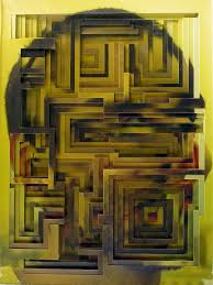

Detailed Photo Analysis (Lucas Simões)
|
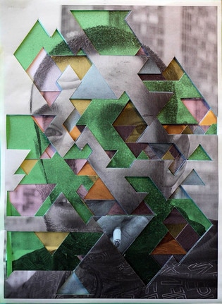
This photo by Lucas Simões is of a man smoking a cigarette that has been distorted by placing colours and shapes over it. The way that he distorts the photos gives it a 3-D look to it. The original picture looks to be black and white but the shapes that have been put over the top have vibrant colours like green, yellow and pink. These bright colours contrast really well with the black and white original photo. The main subject, although some parts are mixed up, is really centred in the image. Even though the background is really out of focus, you can clearly see that the main thing in the background is a building. It also look as if the building in the background is abandoned because it looks like a lot of the windows are missing. It looks like this because there is a lot of gaps where there is no reflection
|
|
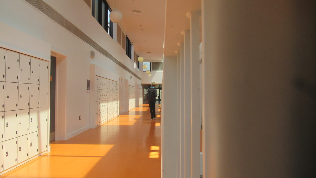
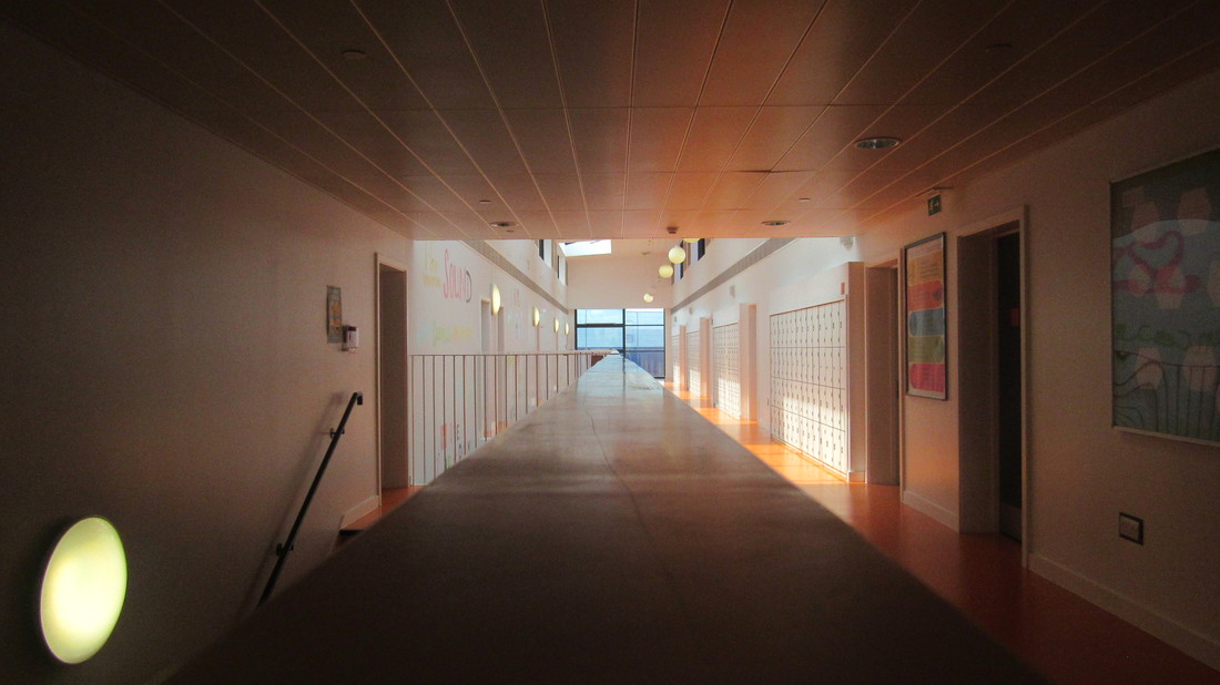
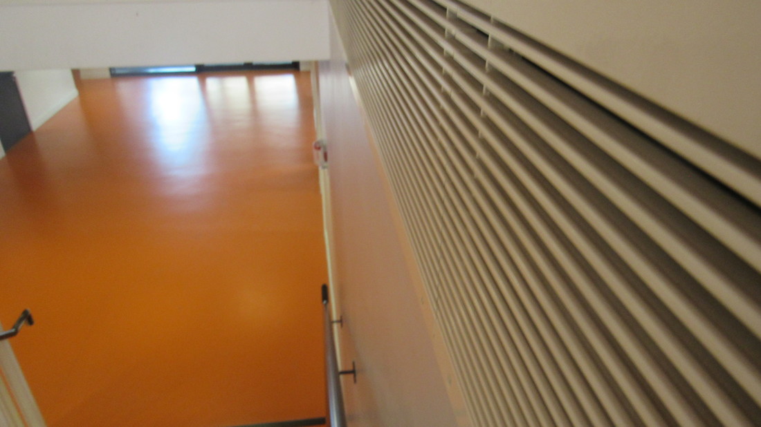
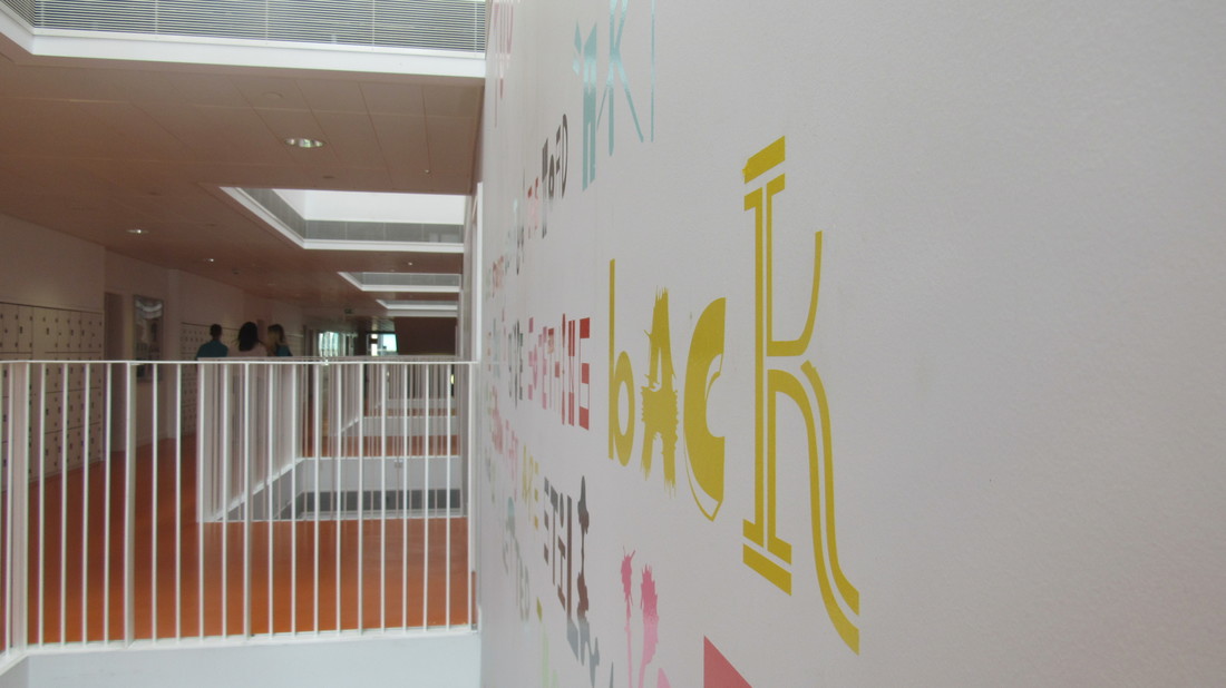
Own Images (Homework)
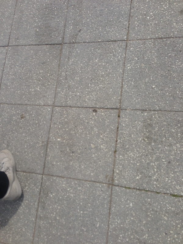
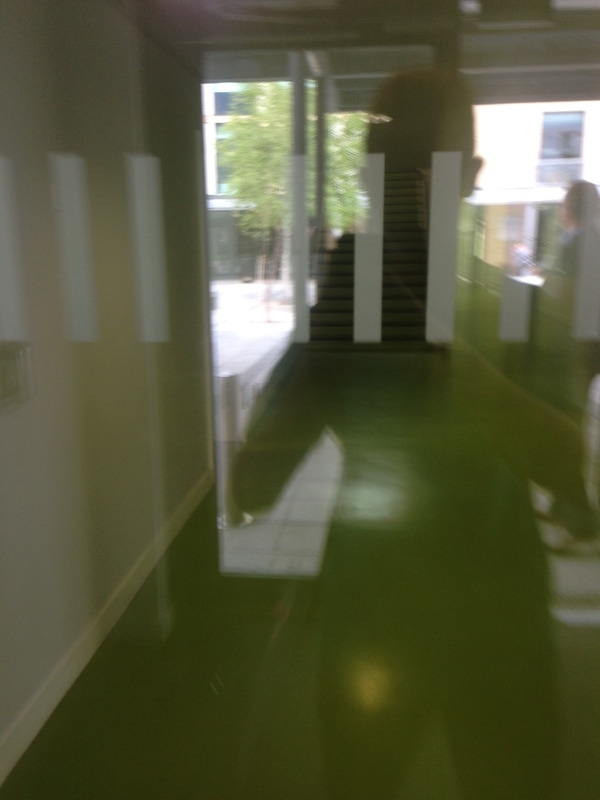
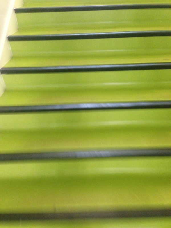
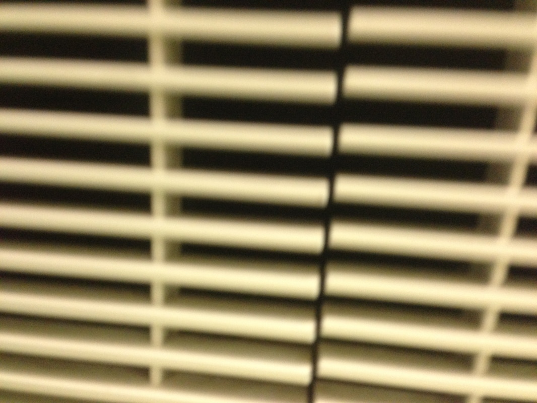
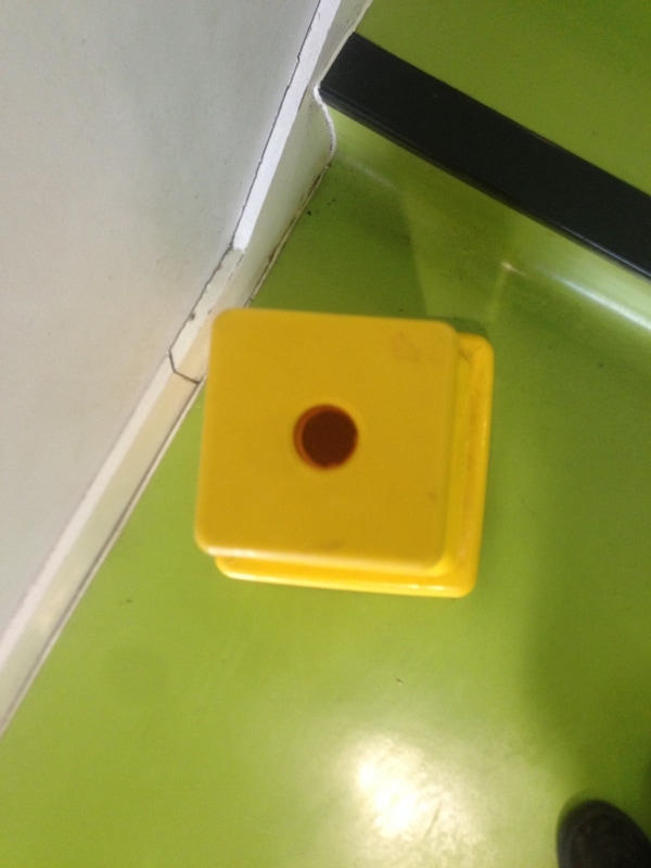
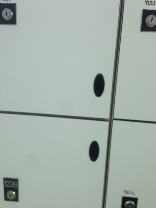
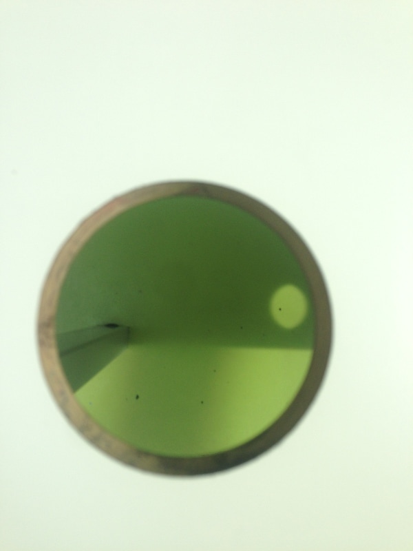
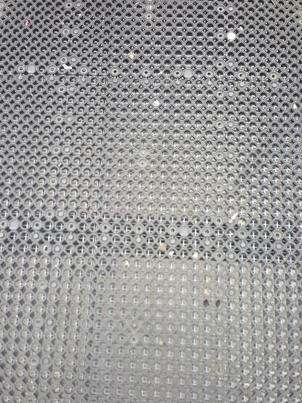
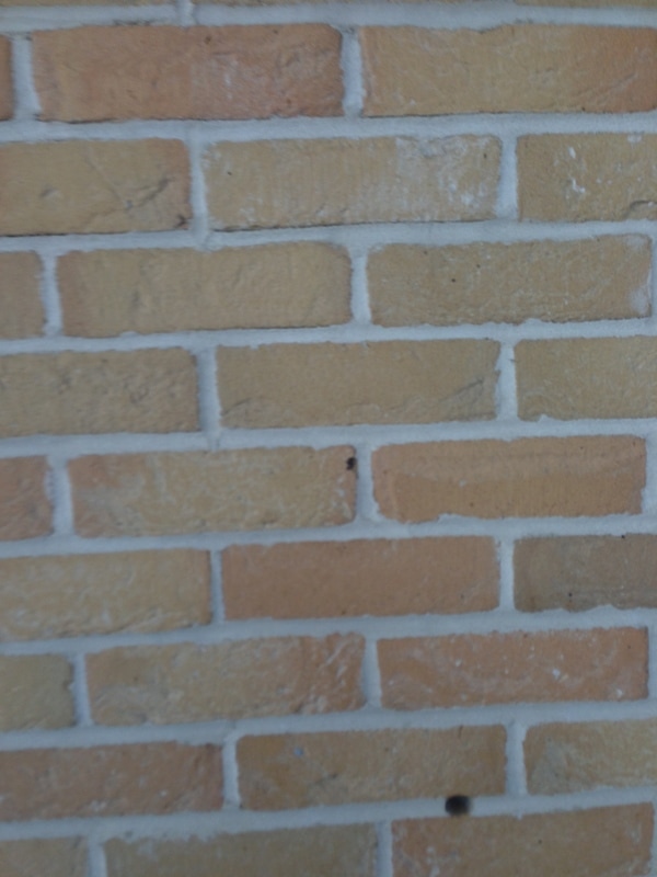
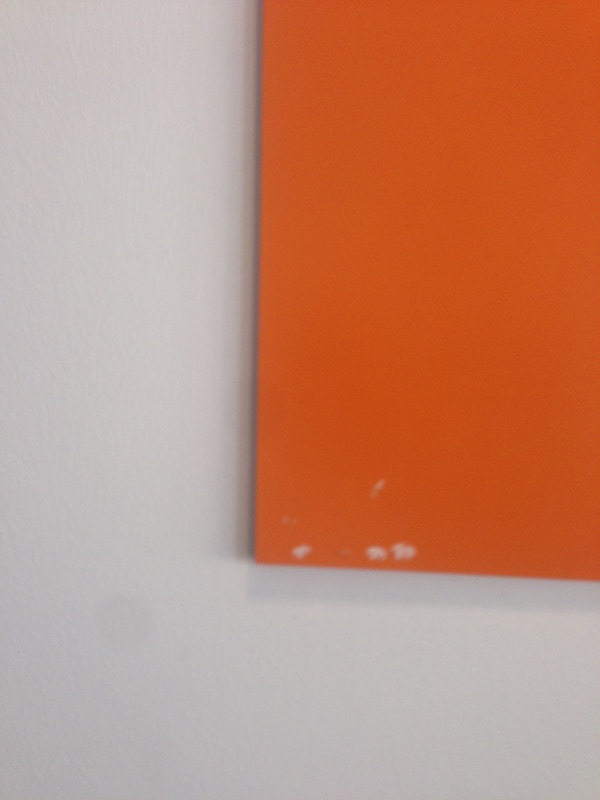
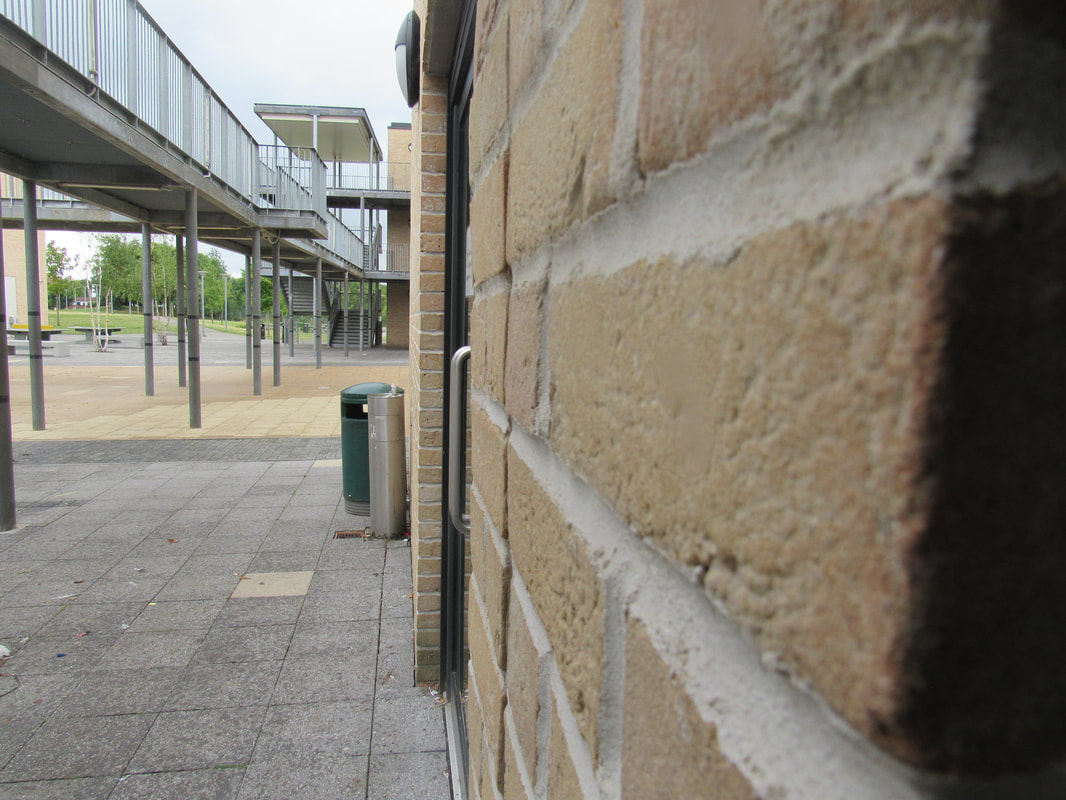
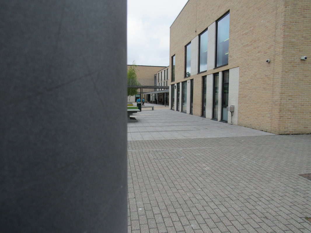
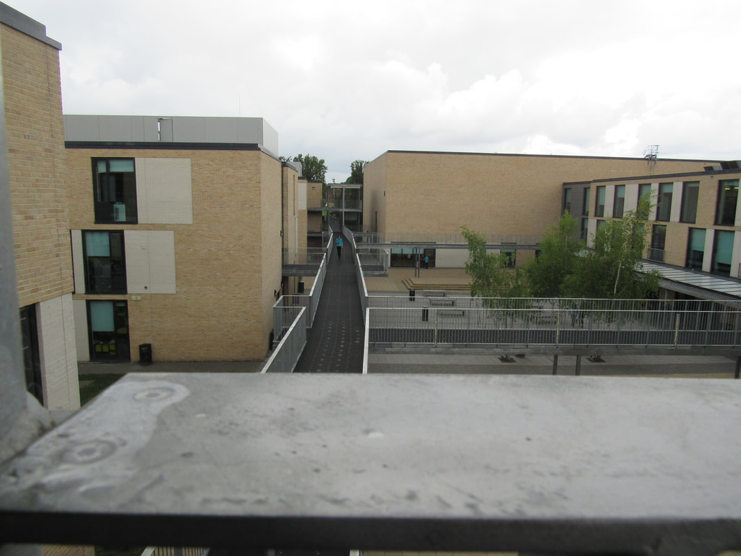
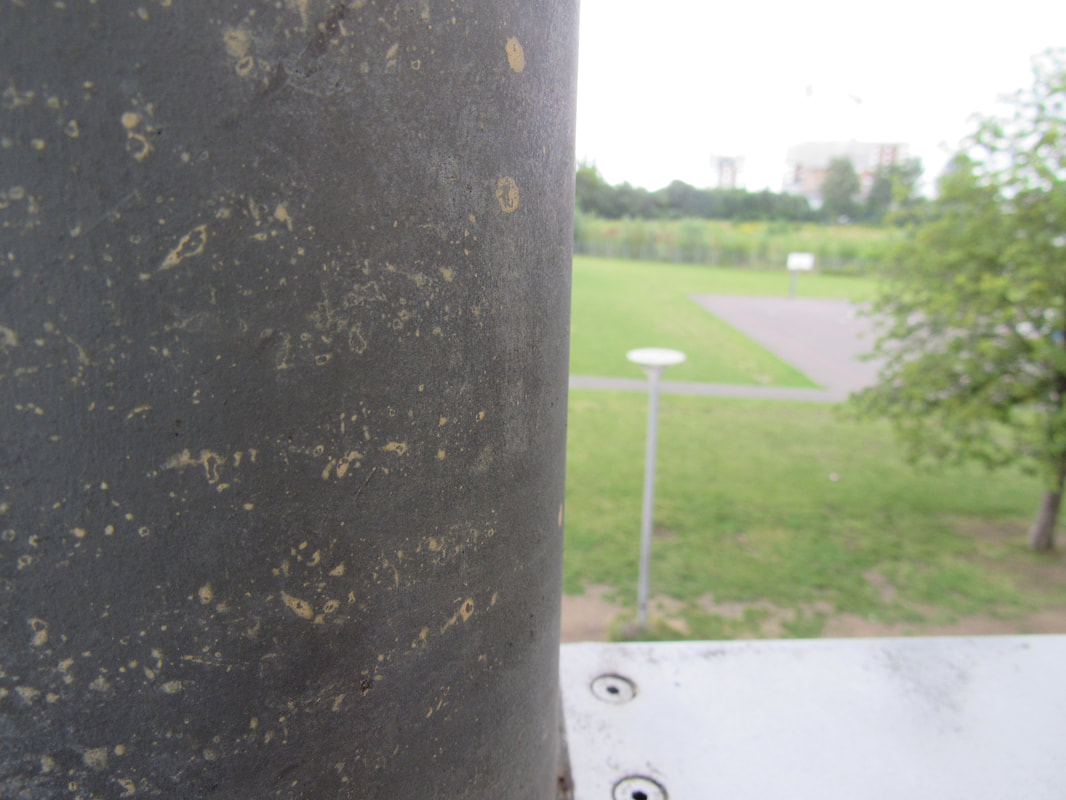
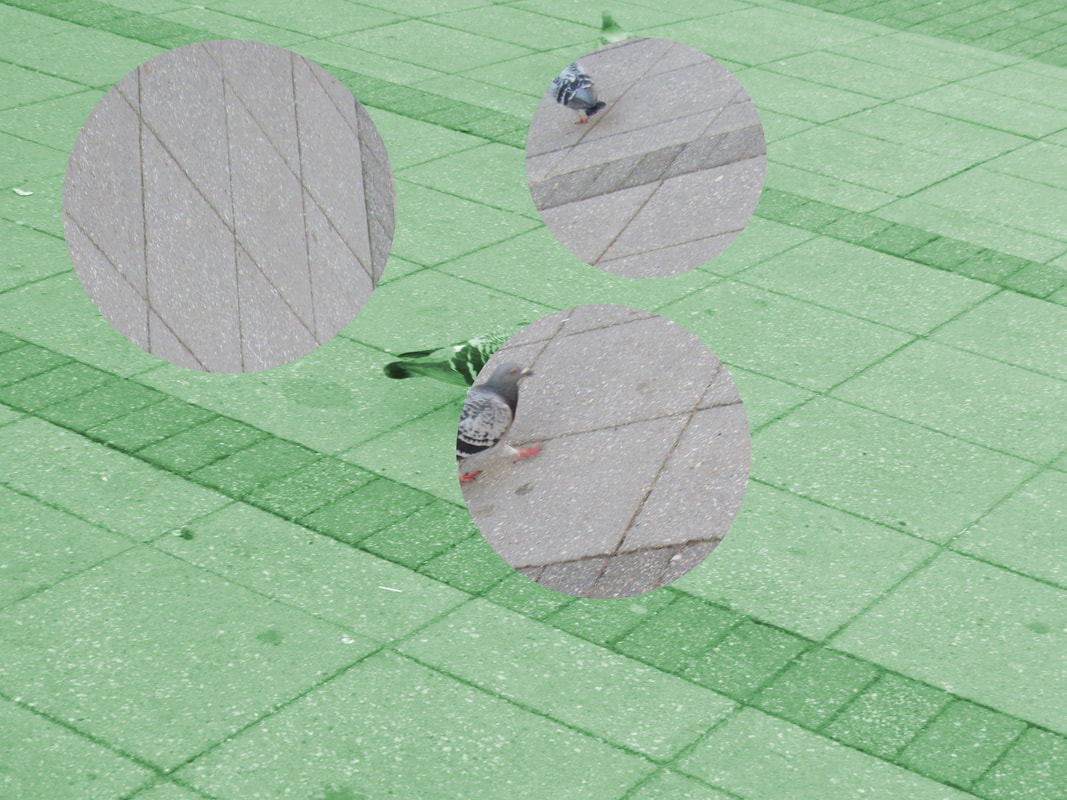
For the homework I had to take 20-30 pictures of fragments. I didn't really know how to do this without using photoshop so I just got pictures where the colours are separated by a darker or lighter colour. I think most of them came out okay but some of them are really out of focus either because I might have taken the rushed it a bit or the camera I used is slightly broken. I had to take some of the photos in school during break/lunch because my phone was broken at the time of taking these photos so I had to use a friends phone during school.
Experimentation
Edited Photos
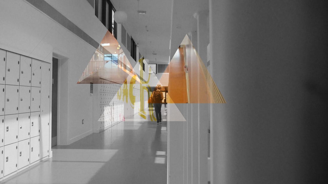
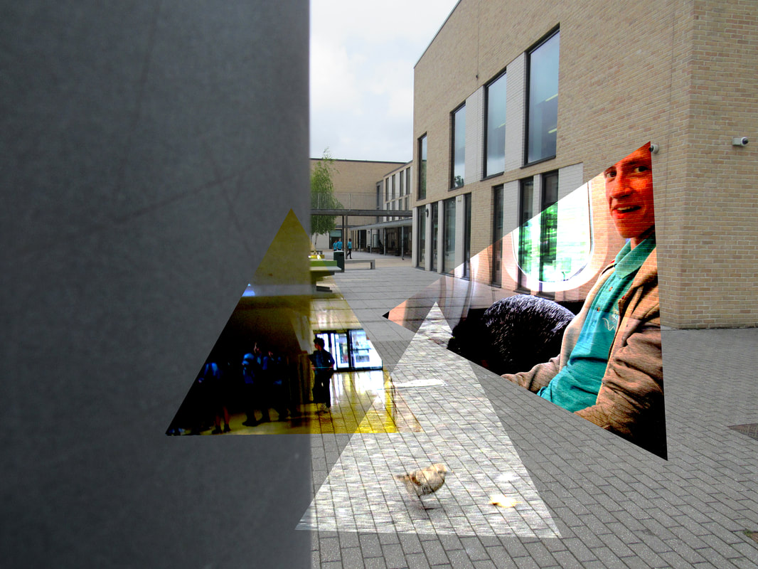
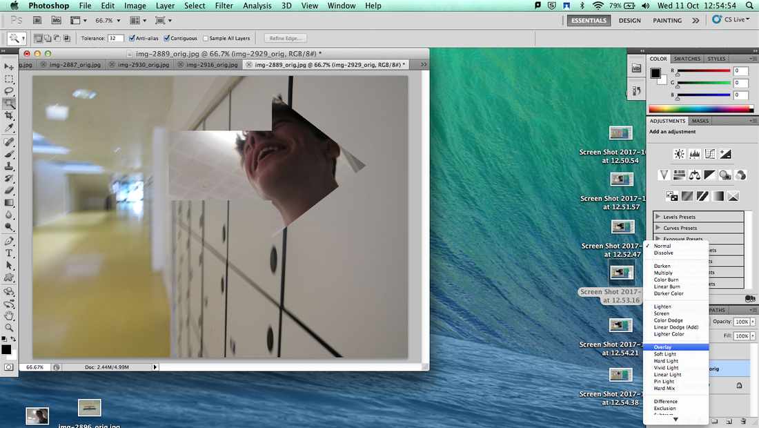
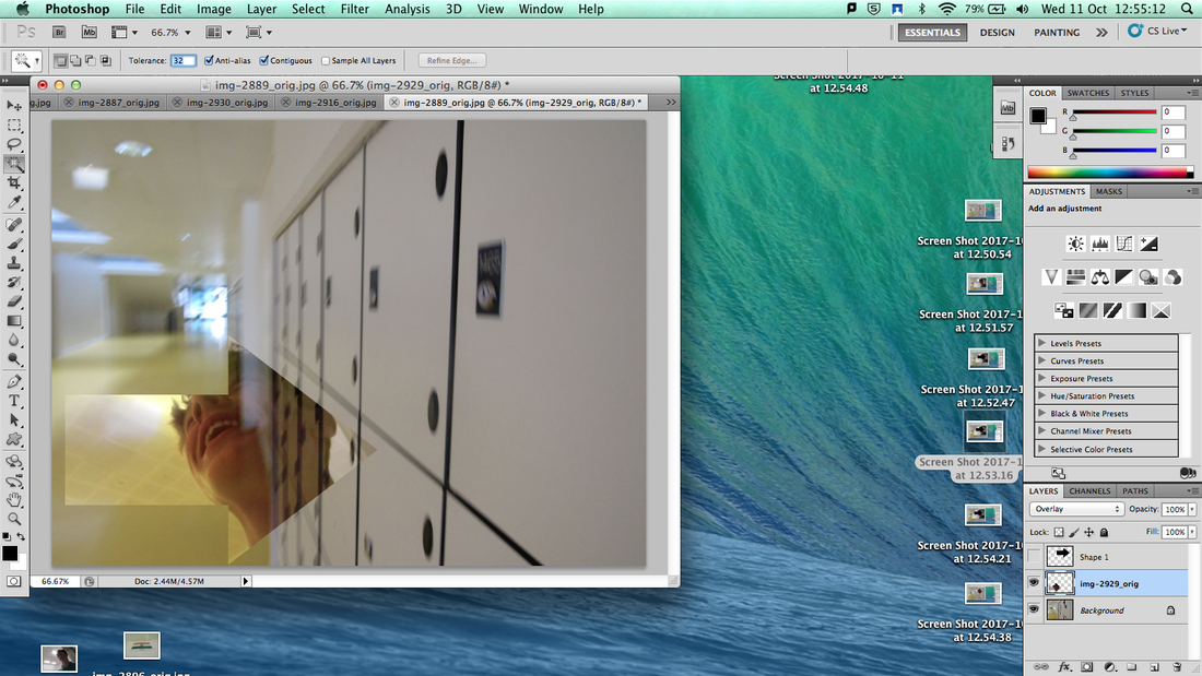
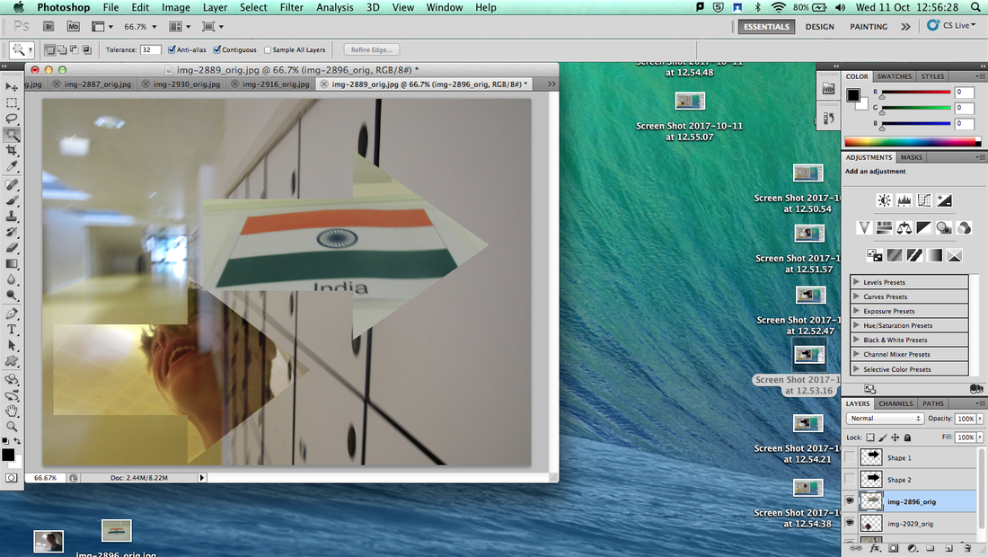
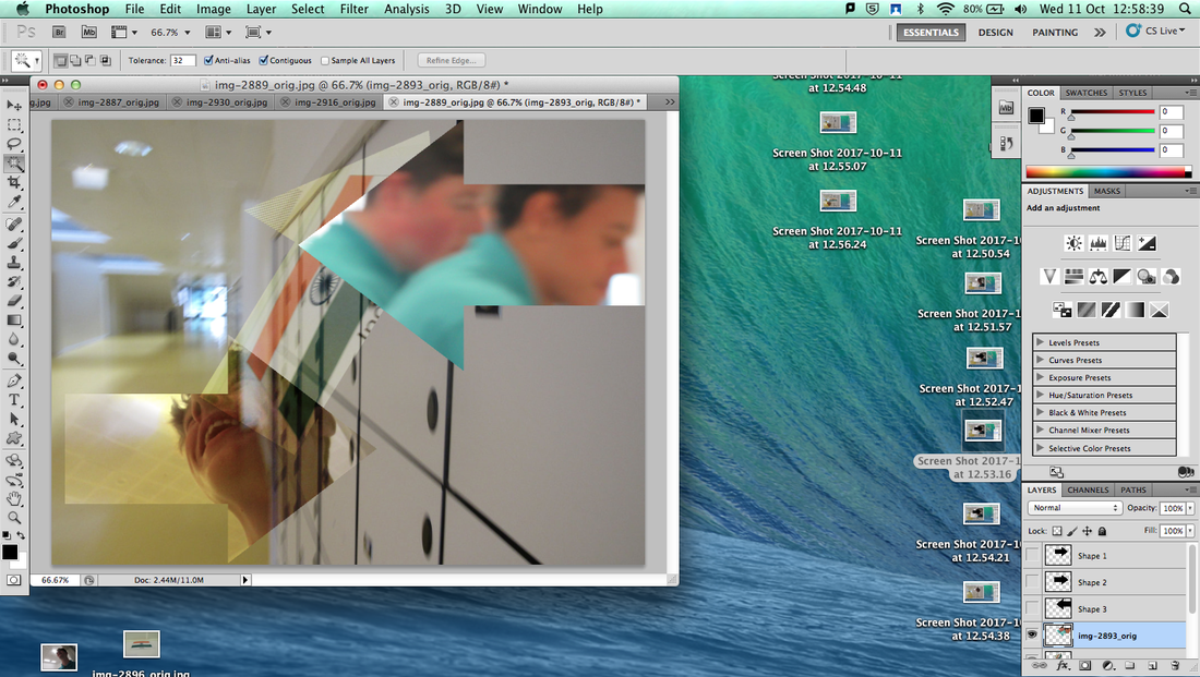
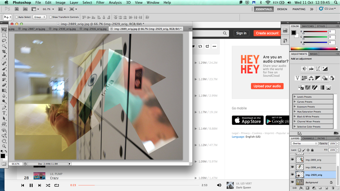
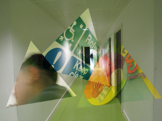
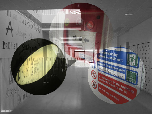
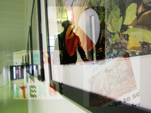
In this experiment first experiment, I took photos that were quite plain and didn't have much detail to them to use as a base layer. Once I had a base layer I took photos of people or different things that had more detail to them and were quite interesting. Once I was happy with the pictures I had taken I went on photoshop and started editing. The first thing I did was make the base layer black and white. I then layer one of the more detailed photos on top and used the shape tool to select a part of the photo that would good in that shape. Then I made the shape slightly transparent by changing the blending mode to the overlay mode. This gave it the effect that you can see through the shape but the detailed photo keeps it's colour. The first image I created was a bit difficult but after that I got used to it which made it much easier to repeat the process.
Further Experimentation
Edited Photos
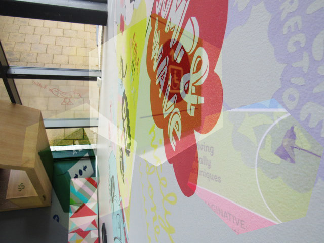
In this experimentation I basically used the same editing techniques as the last set of experiments but this time I left the base picture in colour. I also made the pictures that I used for the shapes/overlay brighter than they were before as well as keeping the opacity higher than it was before. I also tested with the size of the shapes to see if the outcome would look better if it was bigger, smaller or in between. I came to the conclusion that the bigger shapes look better because with a lower opacity because it covers up more of the base photo but you can still see what it looks like underneath because of the low opacity.
Further Experimentation
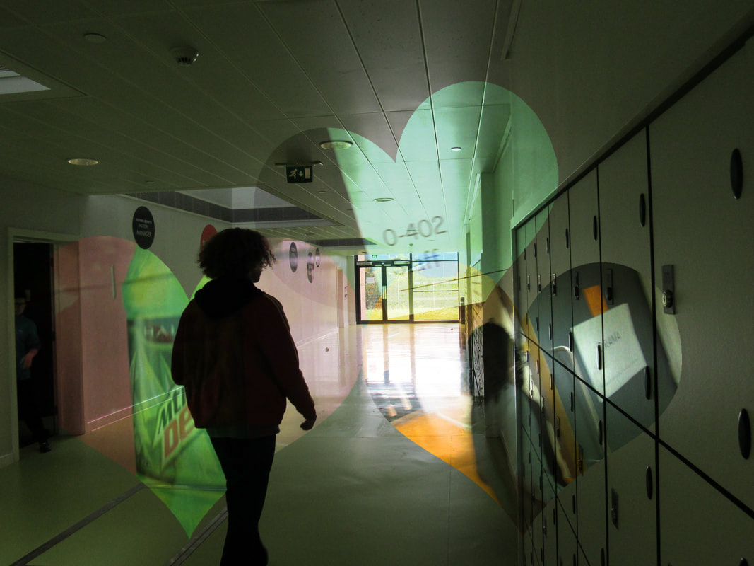
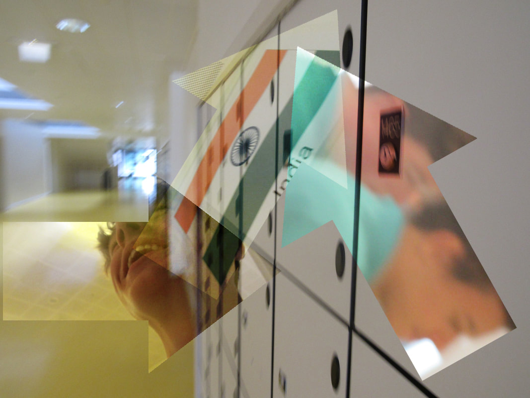
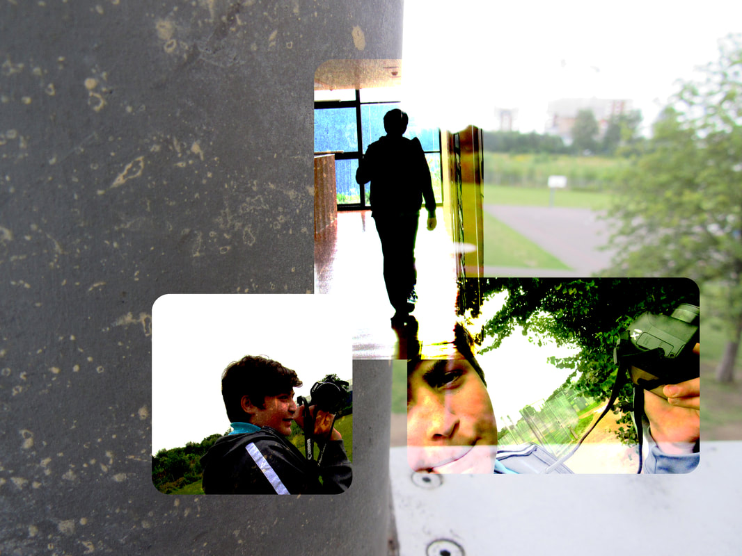
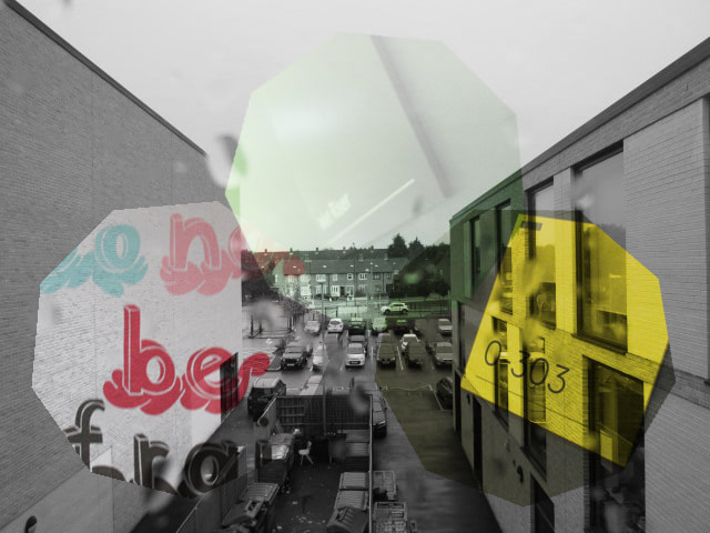
In this experiment I did a few things different to the previous experiments to see if I could make the experiment more interesting or if it would look worse. The first thing I changed was that I made 6 different images in the experiment instead of 4. The second thing I did different was that I made half of the images black and white and the other half in colour to see if the would contrast with each other and make the experiment look better as a whole. The last thing I changed was that I used more interesting shapes such as hearts and arrows in an attempt to make the images look more interesting. I liked the amount of photos that I did for this experiment as well as having half black and white and half in colour, however, I don't really like the shapes because it takes your focus off the image as a whole because there is so much going on. So in future experiments I'm going to do 6 photos instead of 4 and make half of them black and white and the other half coloured. I am also going to go back to using the more simple shapes such as squares and circles so that the focus isn't taken off the image as a whole.
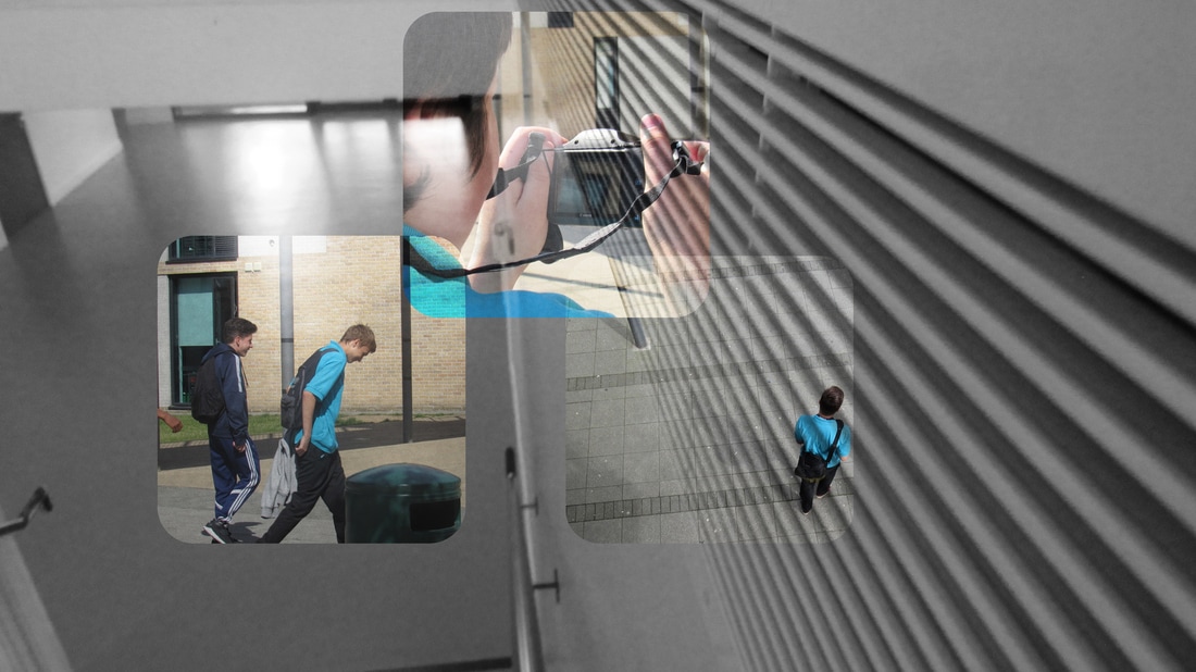
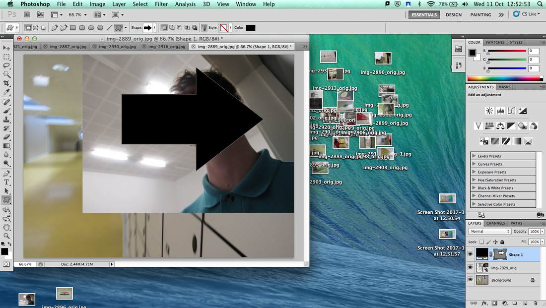
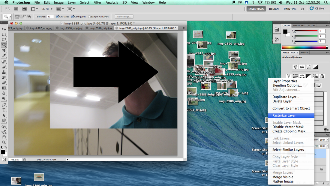
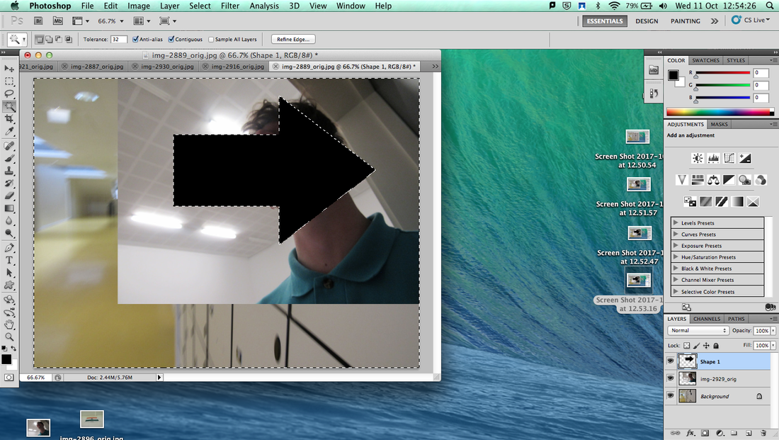
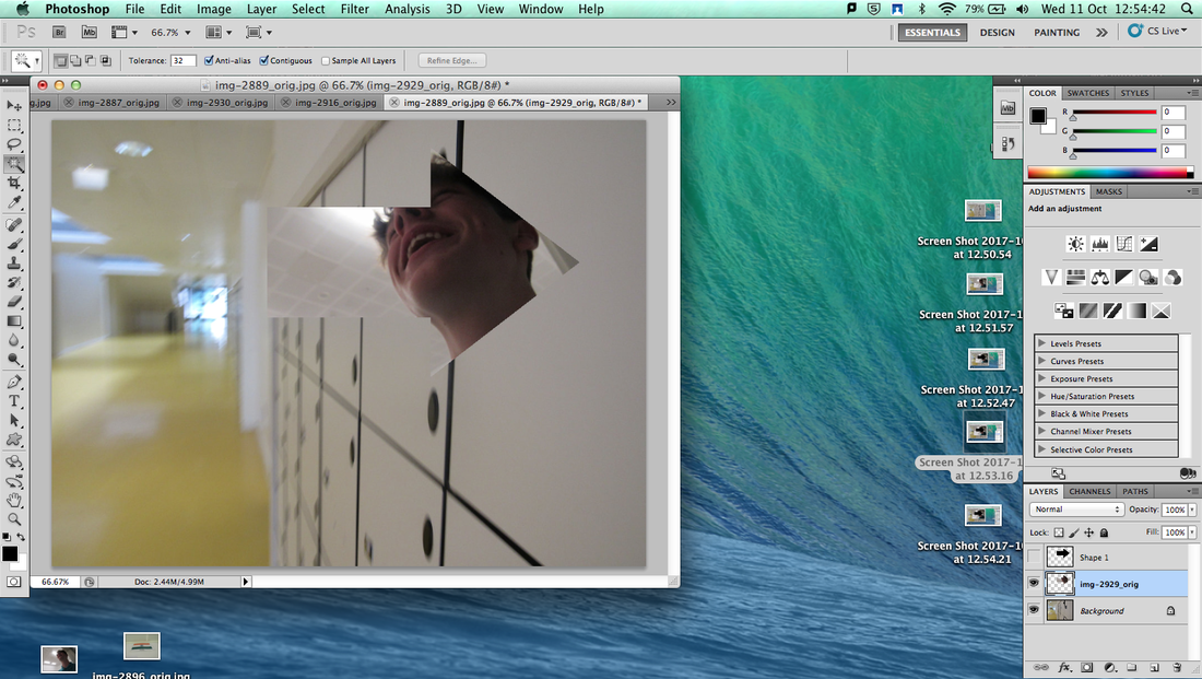
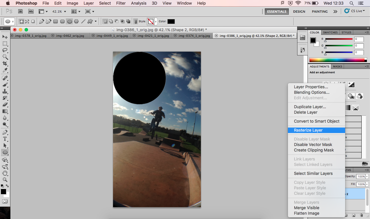
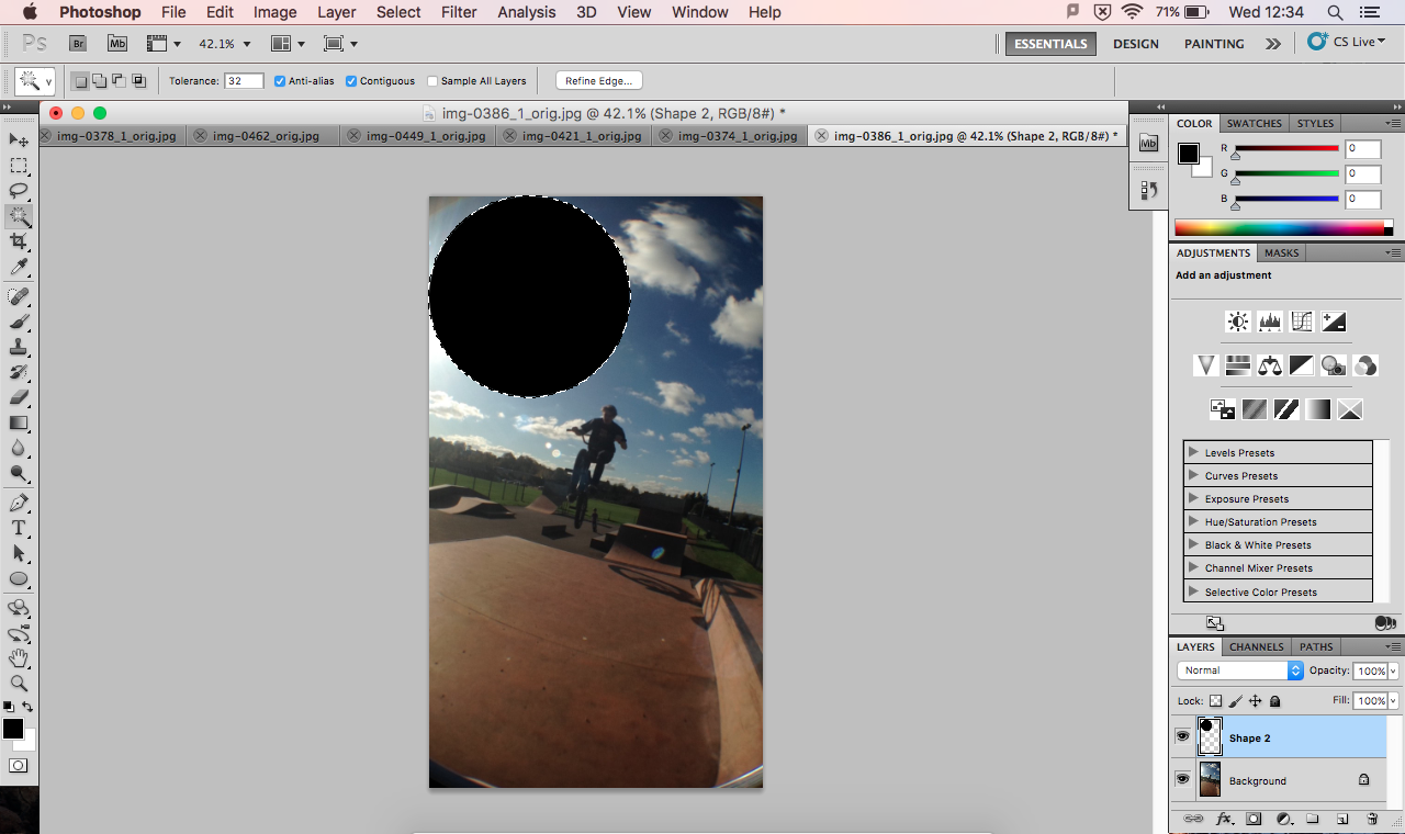
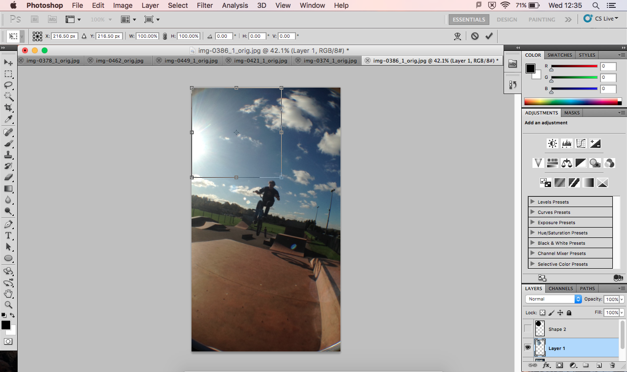
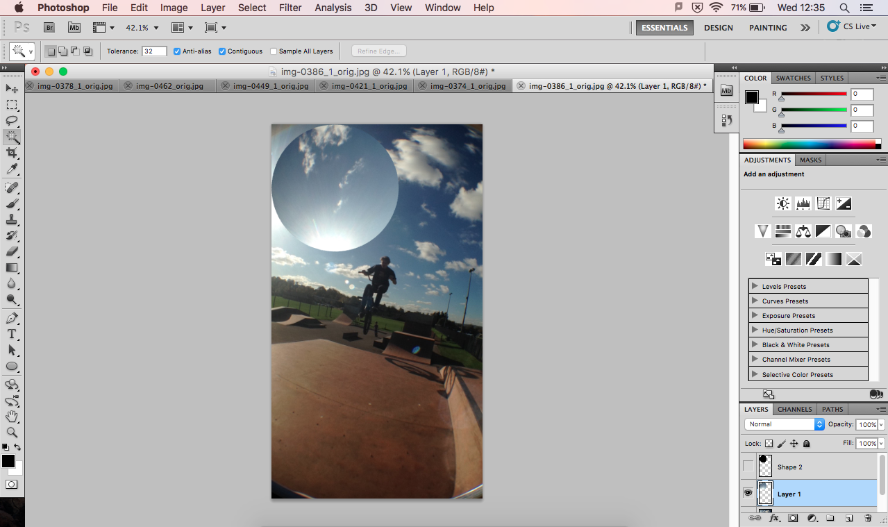
Screenshots of process
Further Experimentation
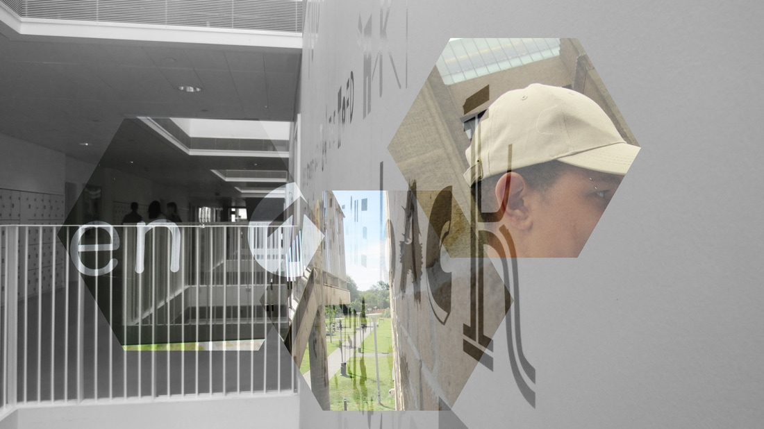
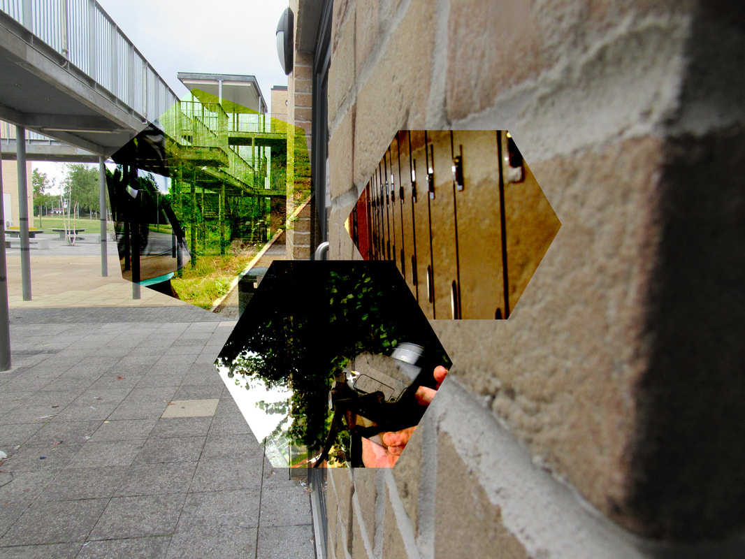
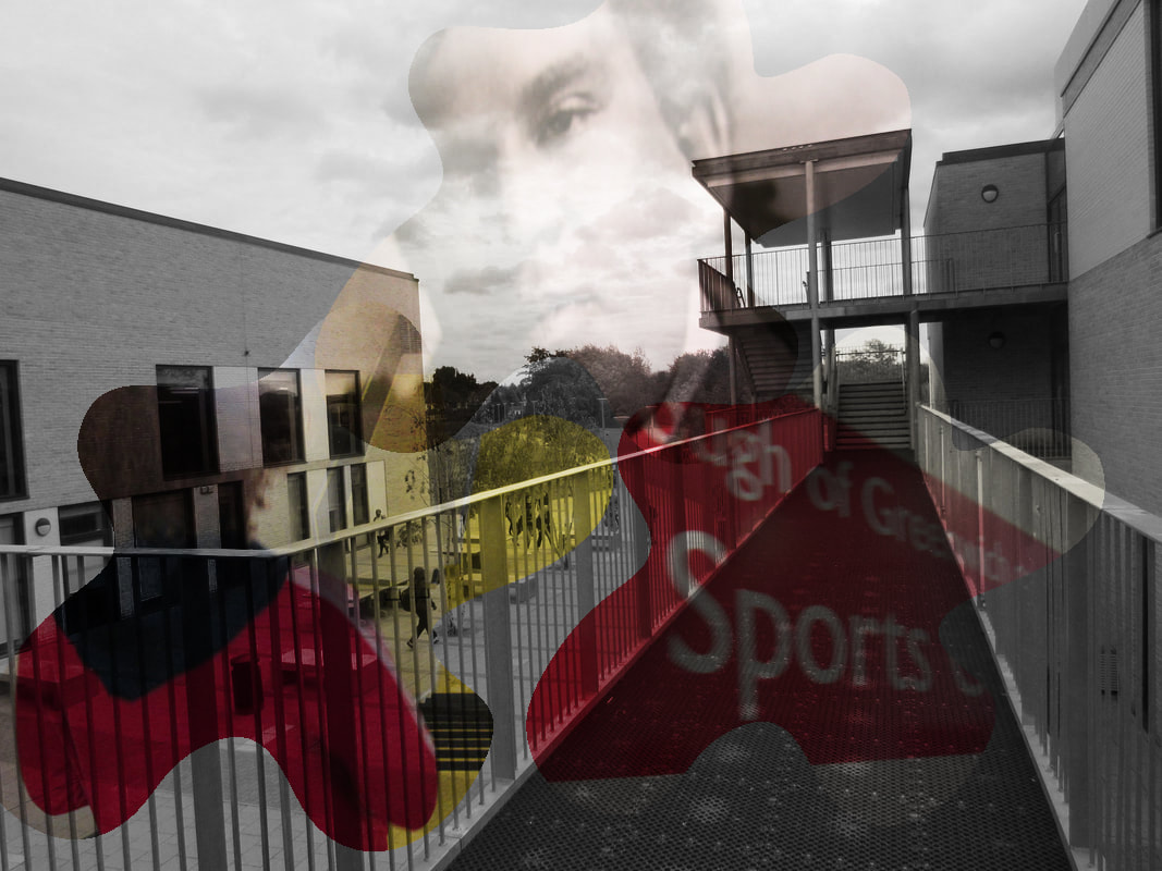
In this experiment the only thing that I changed was the shapes. I made the shapes in this experiment much less complicated because in the previous experiment the shapes took most of the focus off the actual image and onto the shapes. I still used made 6 images and I made half in black and white and half in colour.
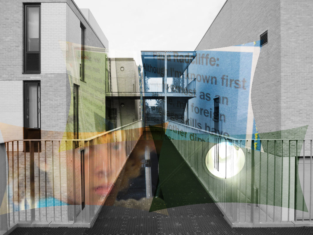
Further Experimentation
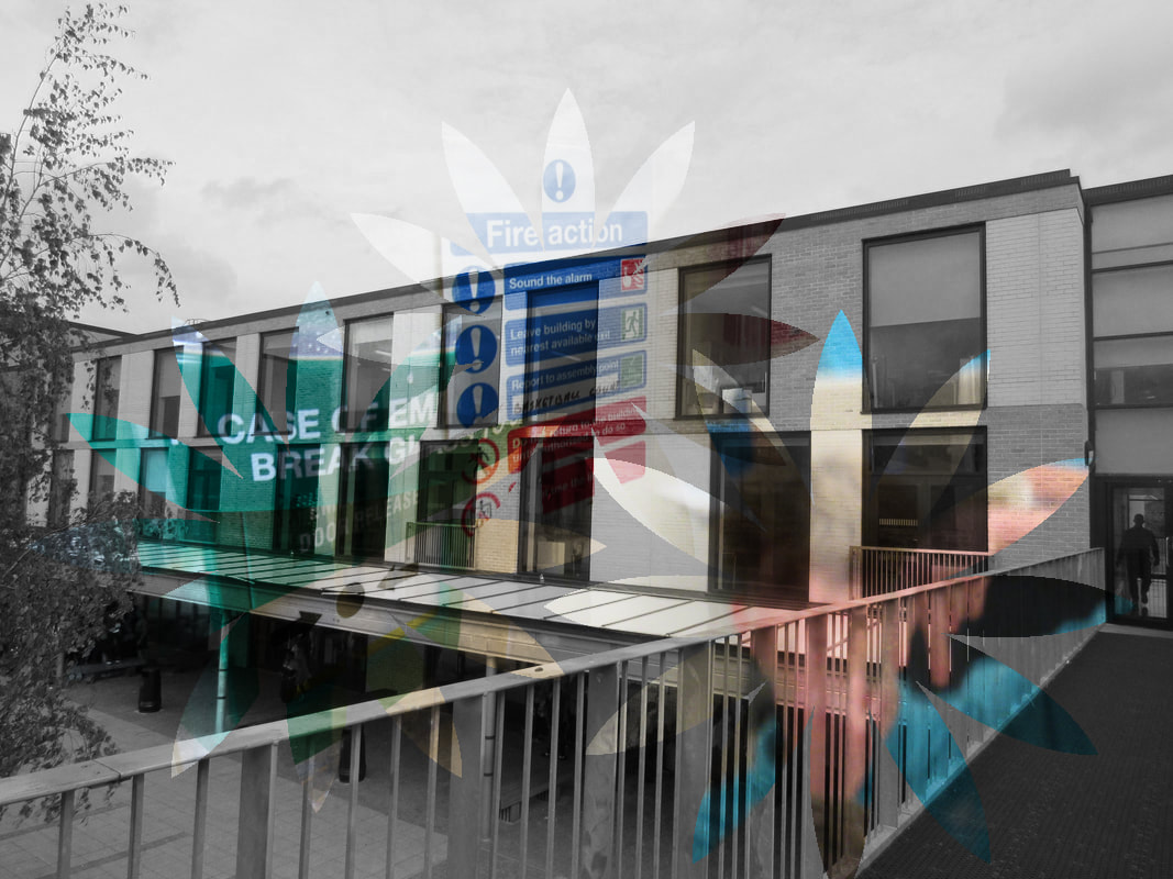
In this experiment I did basically the same thing as my last experiment but I used photos from outside of school to make it more interesting. I used some of the photos that I took for my half-term project. I used the same layout of the six photos with the alternating between black and white and coloured photos. I also used the more simple shapes to take the focus away from the shapes and put it on the photo as a whole.
Further experimentation
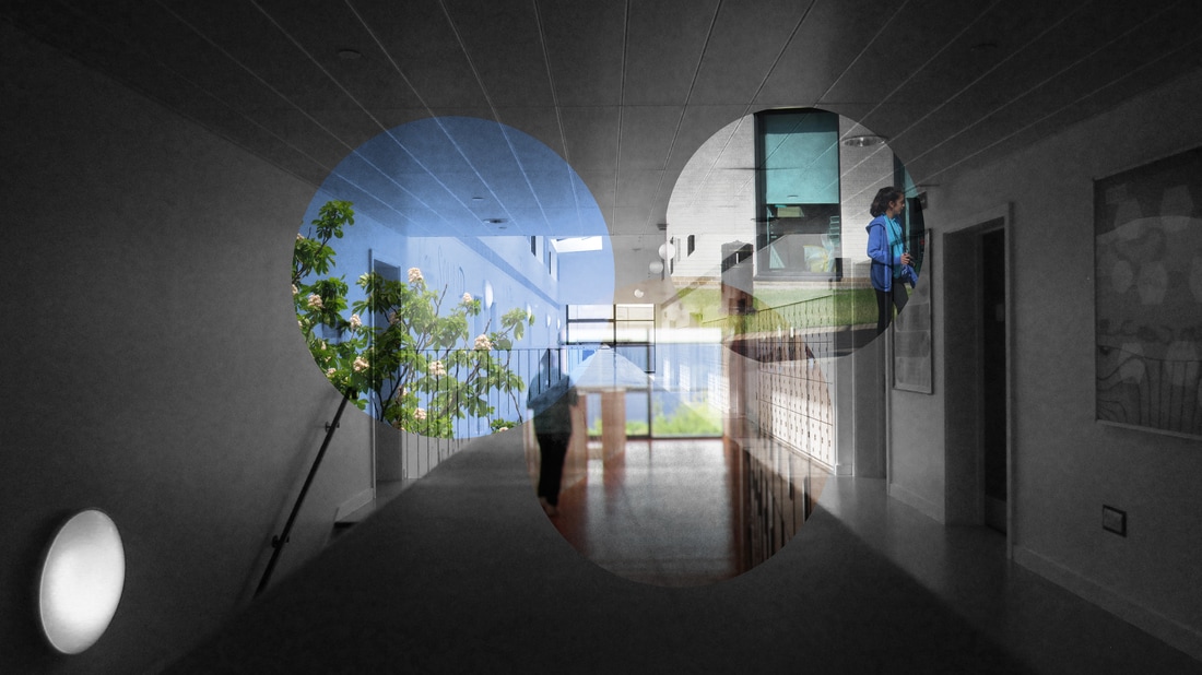
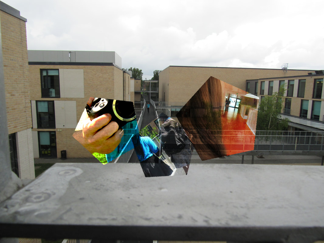
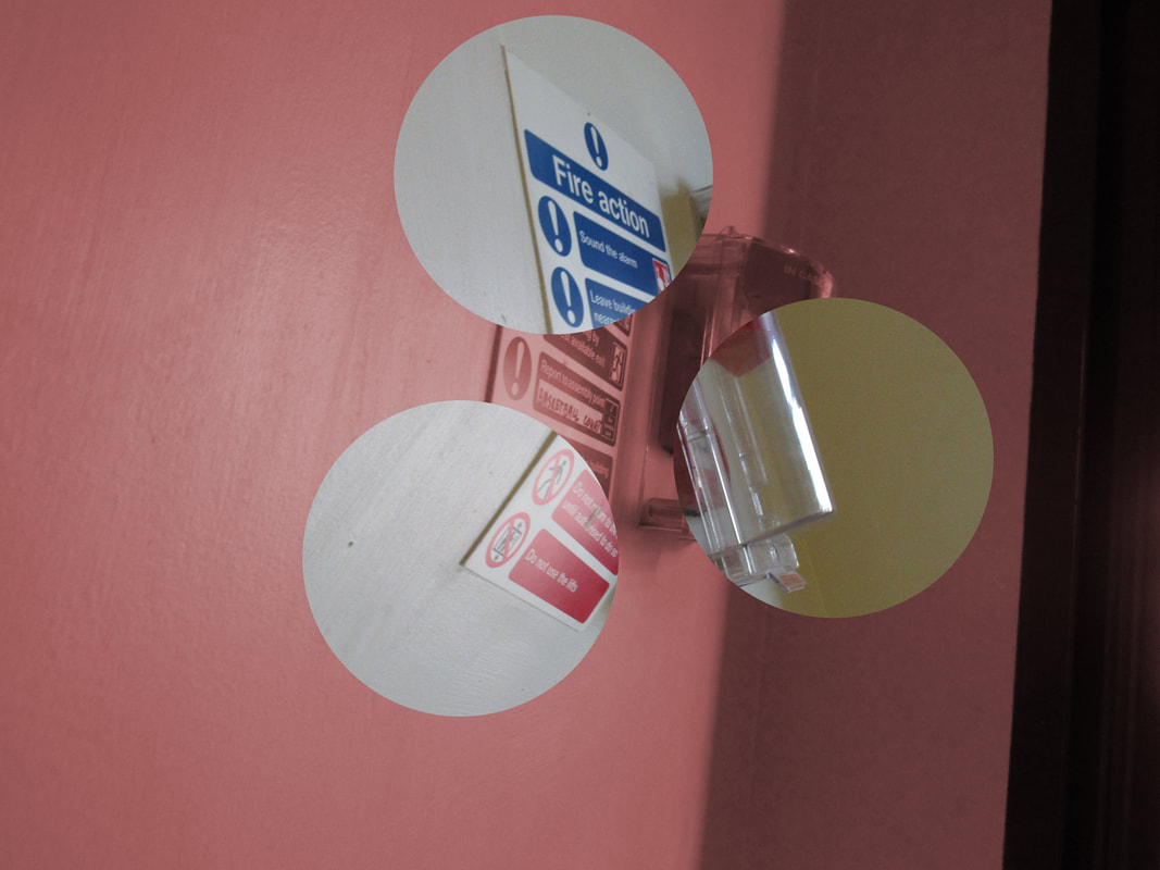
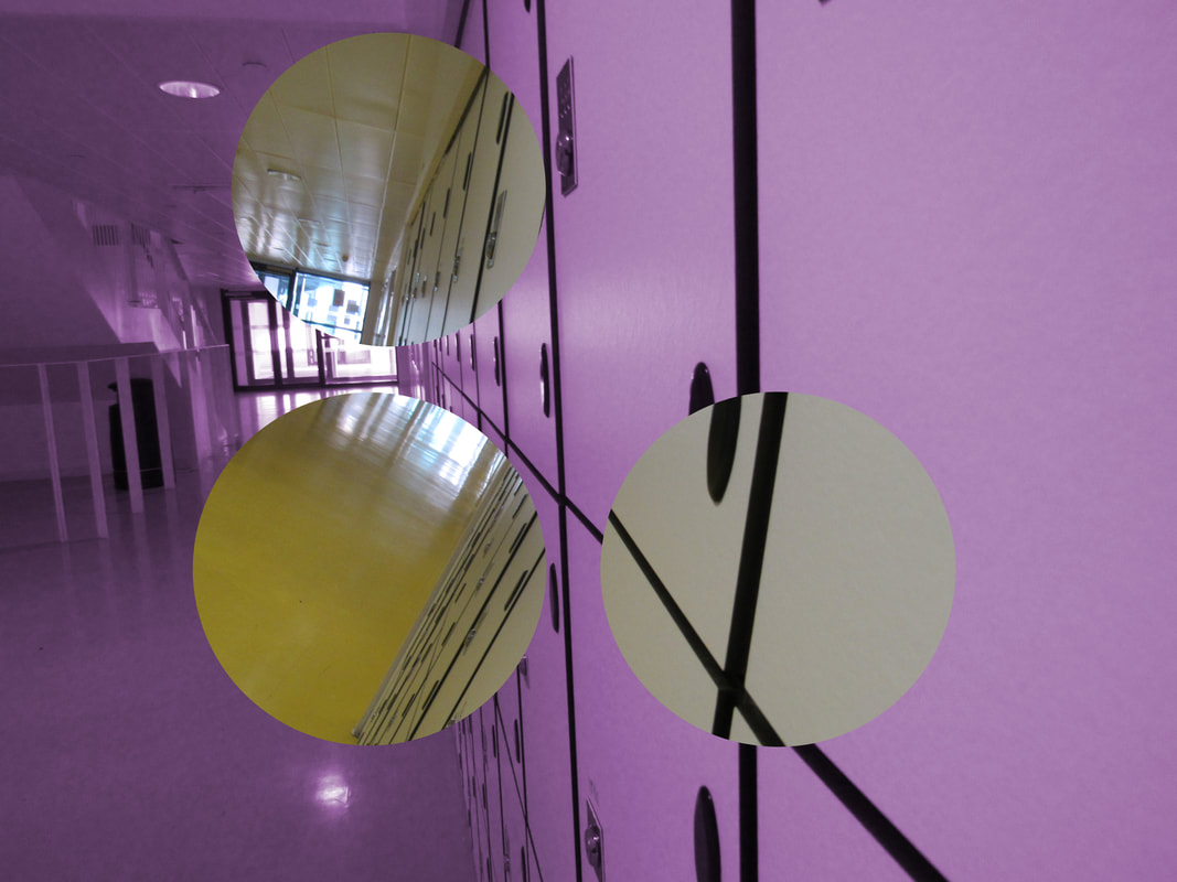
For this experiment I decided to try and do the same thing I have been doing but with only a single base photo instead of using multiple photos layered on top of one another. To do this I selected a part of the photo and rotated it. I used circle because no matter how much I rotate it, it will still fit into the same area but it will be at a different angle. For the next experiment I might put a coloured tint over the rotated are and make the base black and white to see how it looks and what effect it gives. I'm still going to use photos from outside of school though because they're more interesting than any of the photos I take when i'm in school.
Method
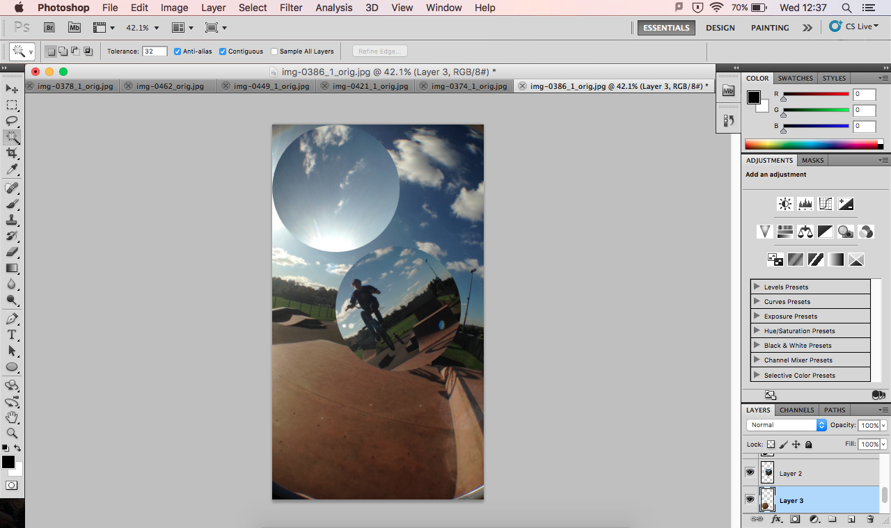
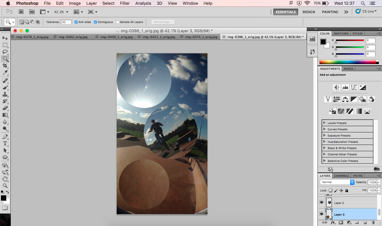
Further Experimentation
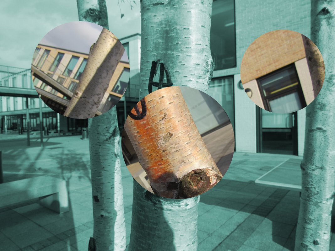
In this experiment, I decide to put a bright colour over the background to see how it looked and to see how interesting it made it look. I don't really like it like this because I feel as if it is hard to tell that the rotated sections are from the same photo as the background without taking a bit of time to realise that.
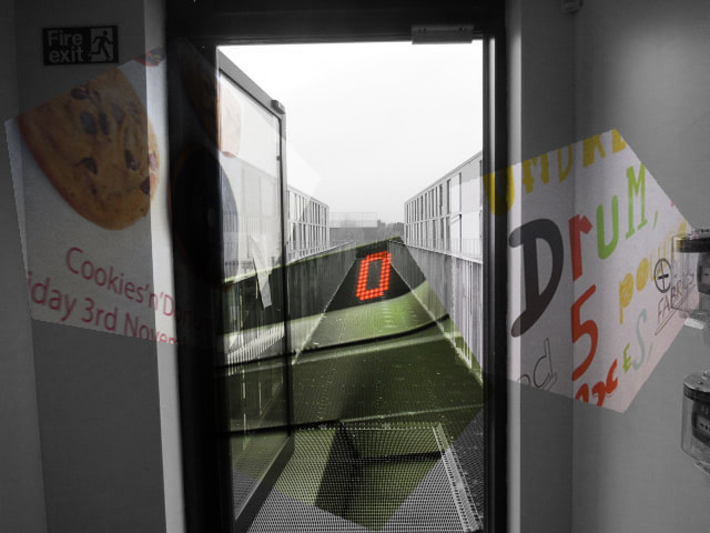
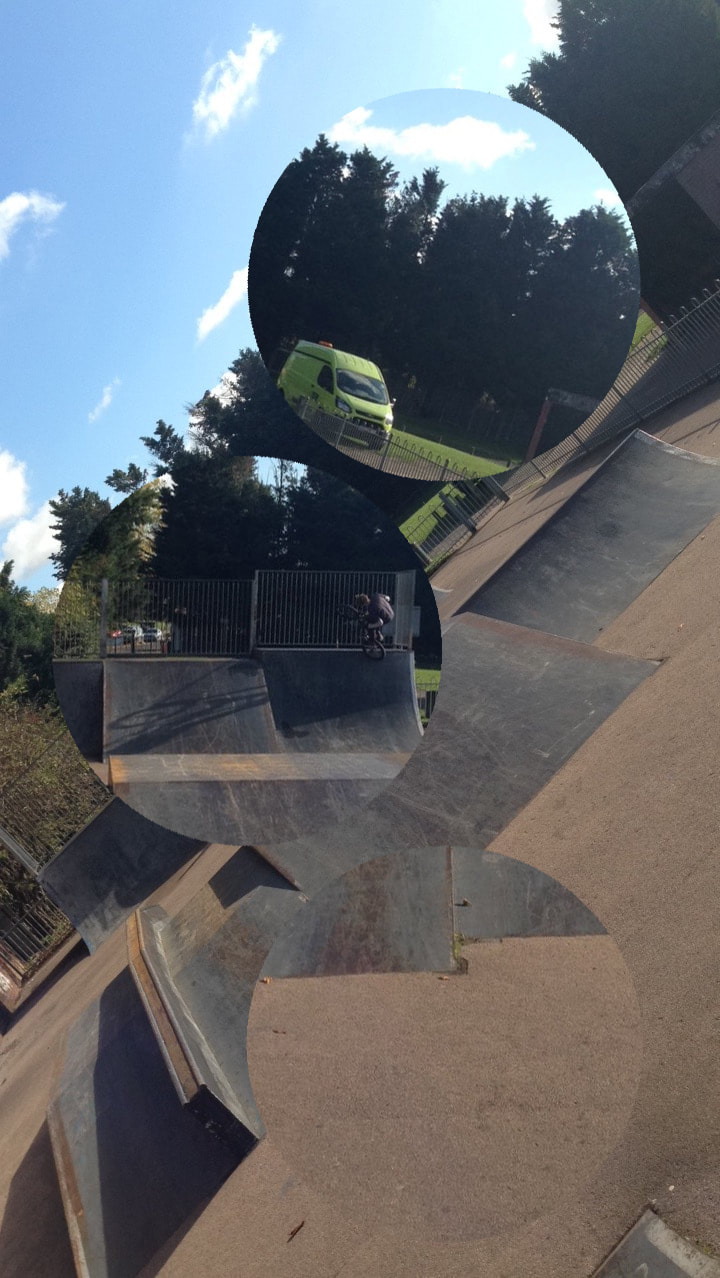
Further experimentation
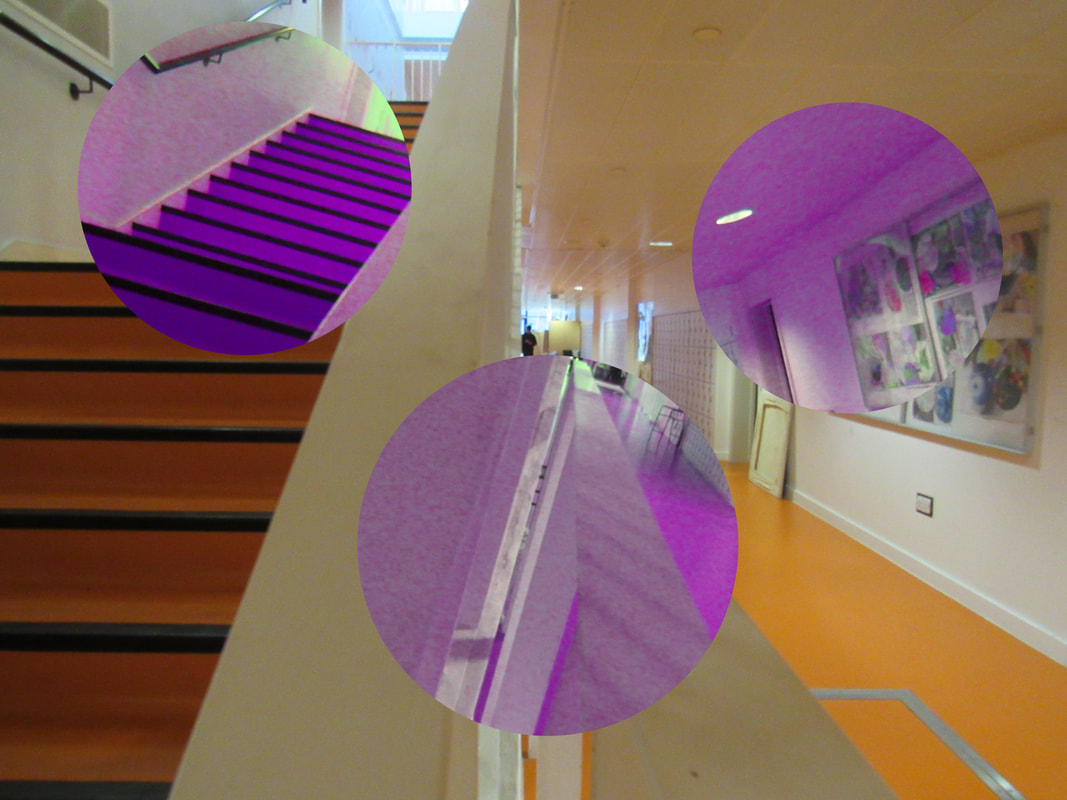
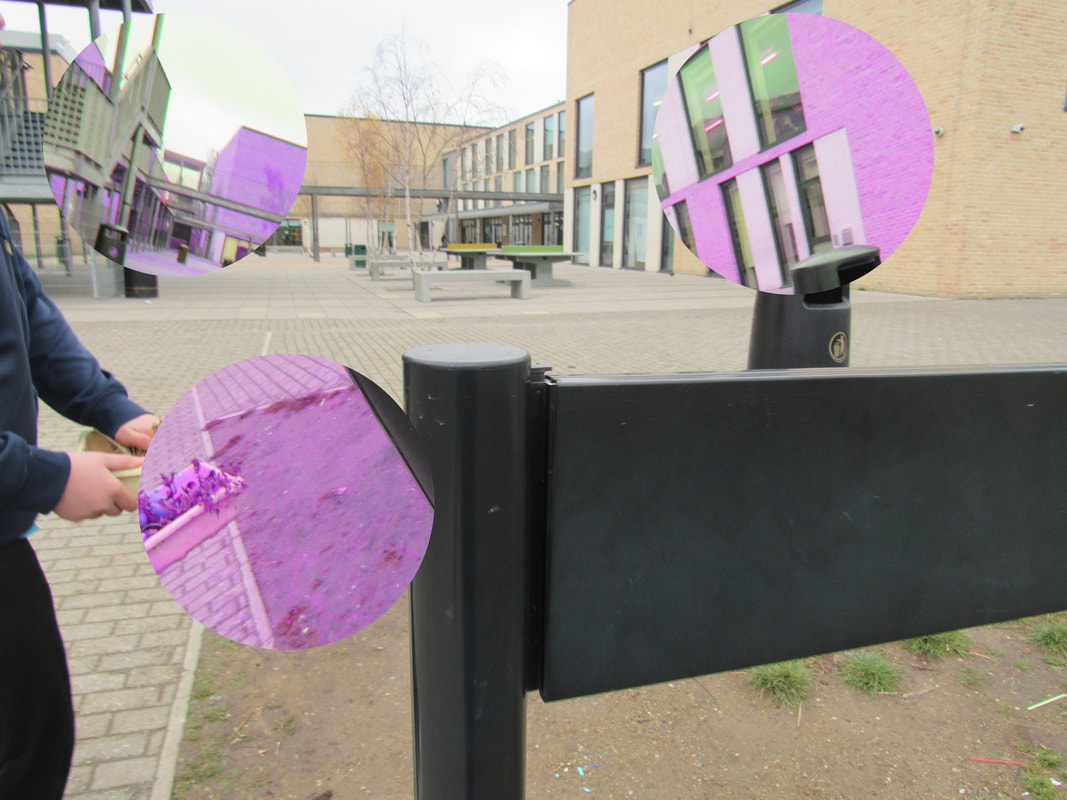
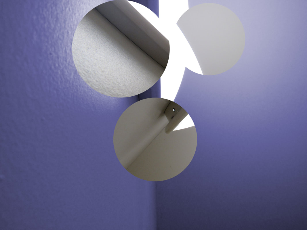
In this experiment i did 6 photos from in school. In my opinion photos from out of school look more interesting because I am more open to what i'm taking pictures of whereas in school I was more restricted on what I could take pictures of because there is much less interesting objects in school. For this experiment I also changed the coloured part of the image to the rotated sections instead of the background because I thought it would look better which I think it does. I think it looks better because when it was the full background that was coloured, it was very overwhelming and took the focus off the image itself and puts it on the brightly coloured background. Another reason why I prefer colouring just the rotated section is because you can clearly see that they're still from the same photo and that it's just rotated a bit.
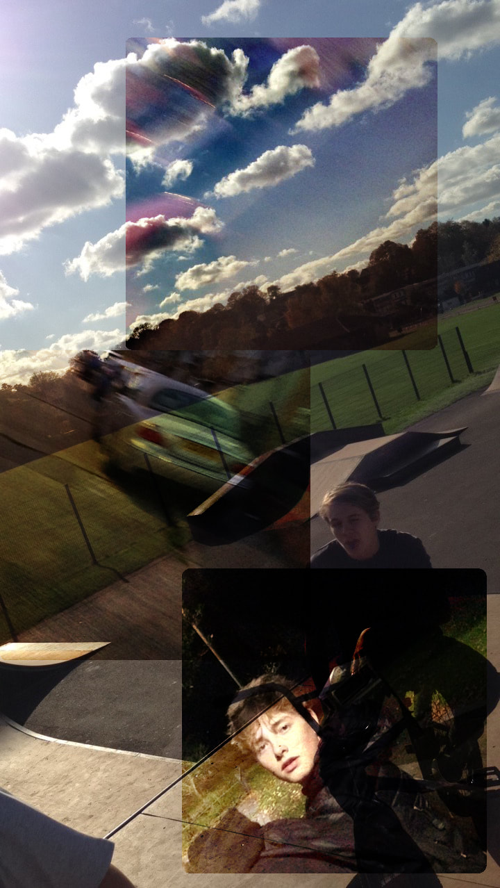
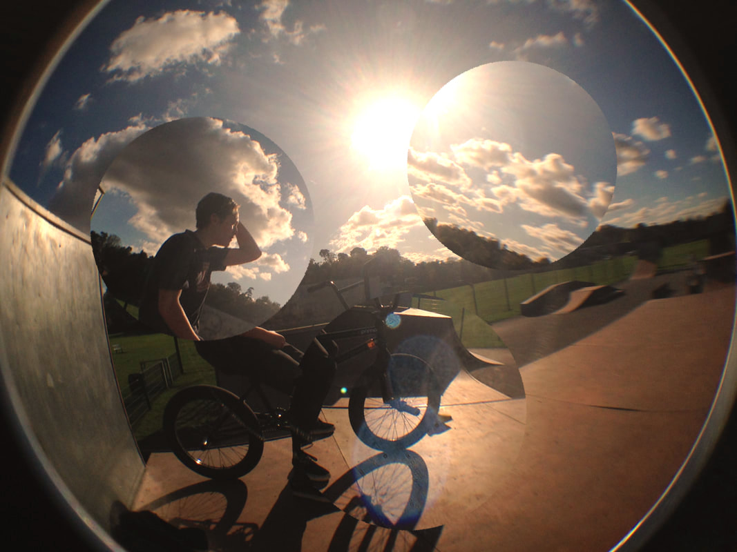
Final Piece
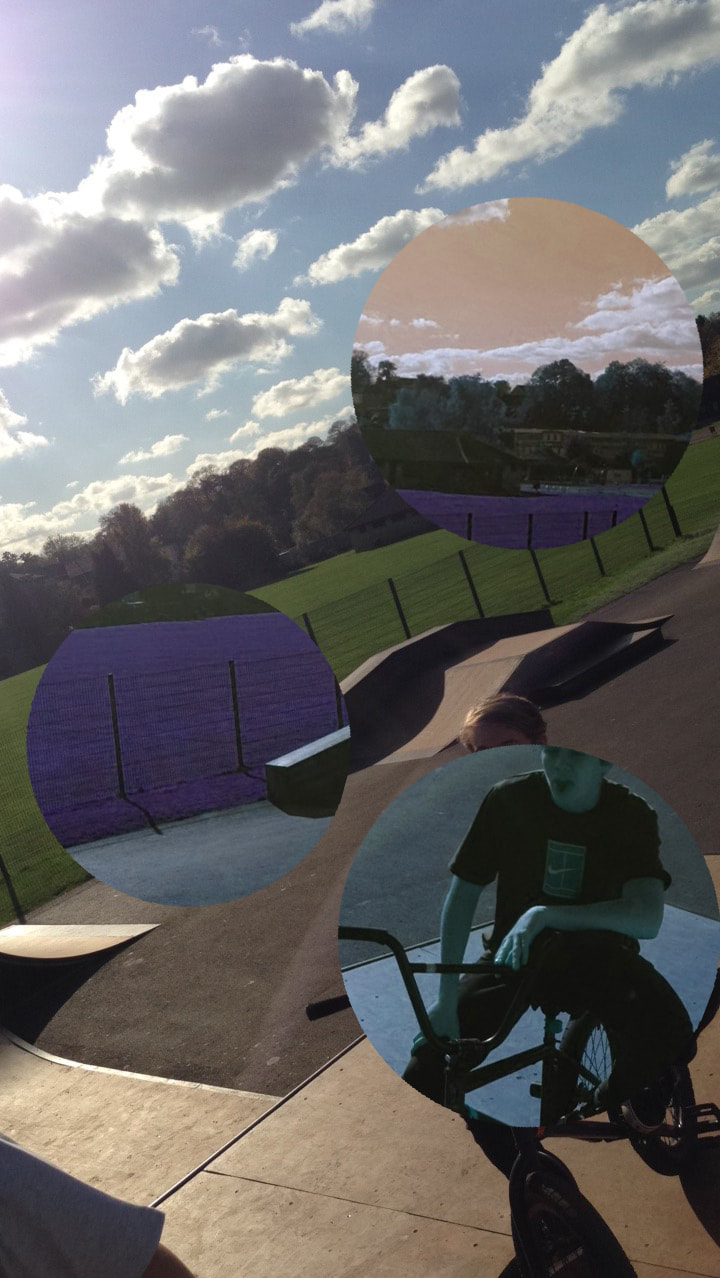
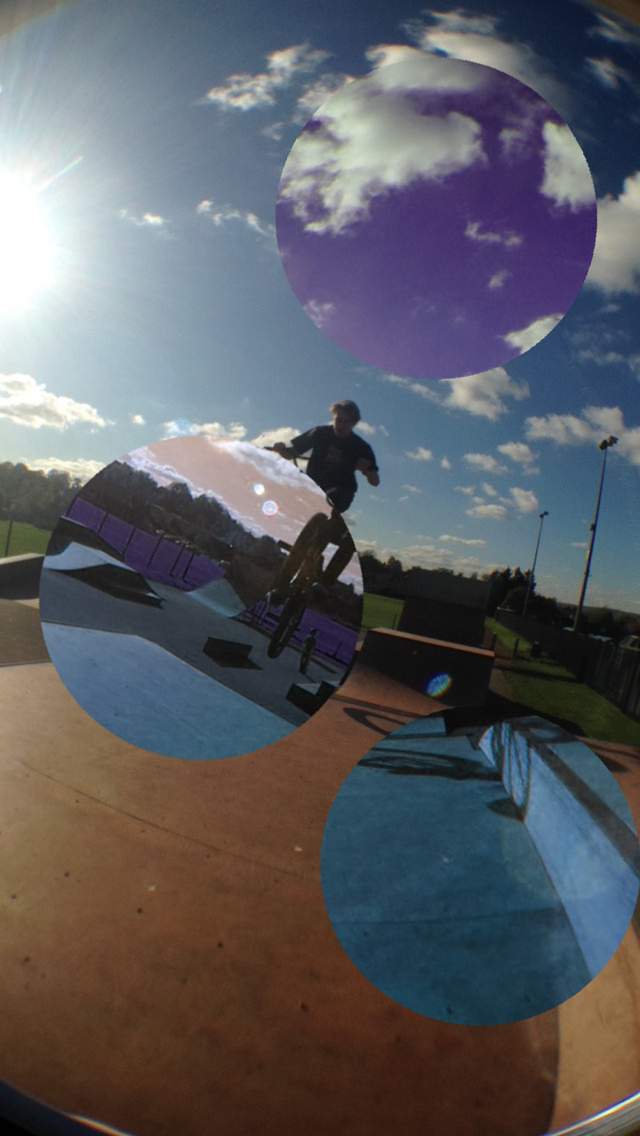
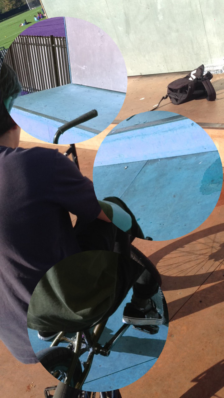
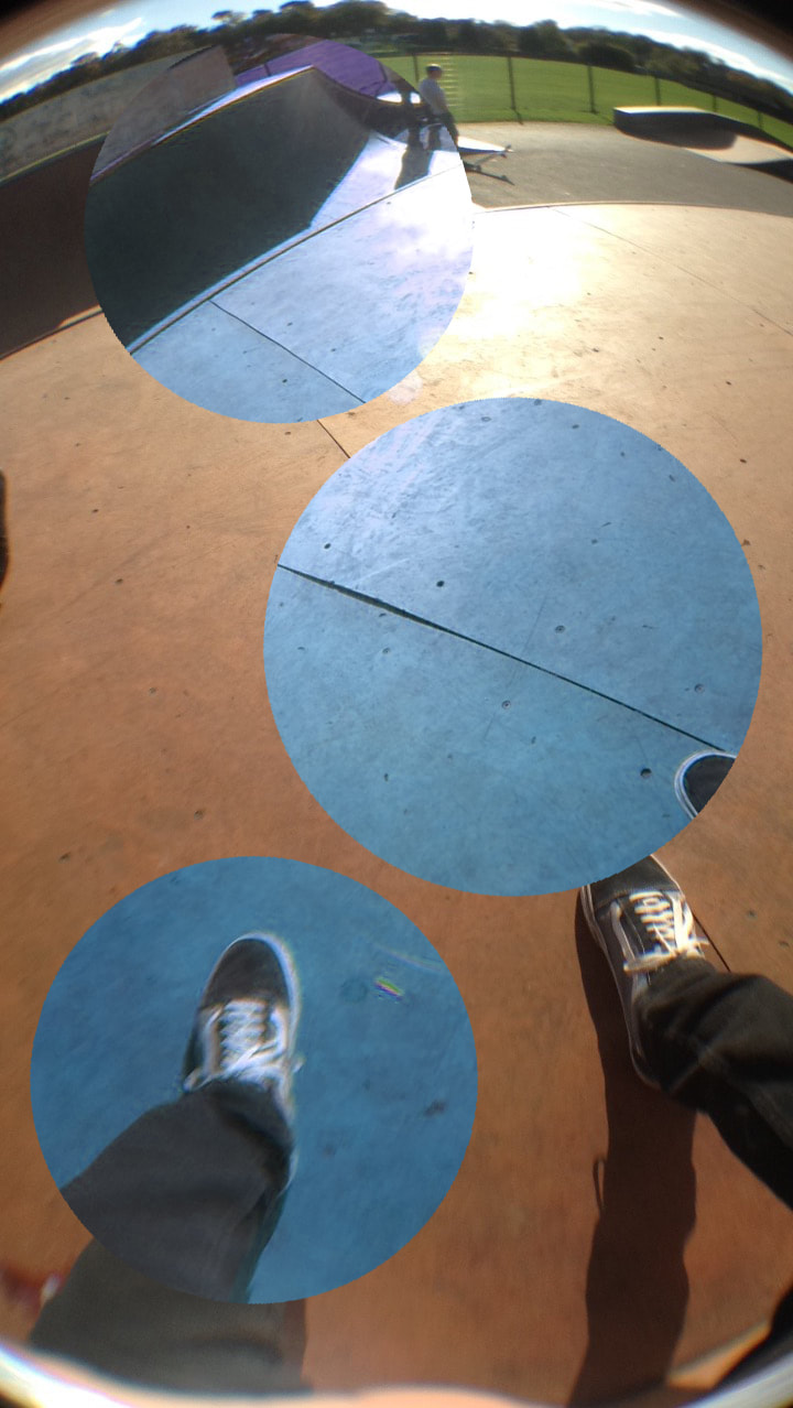
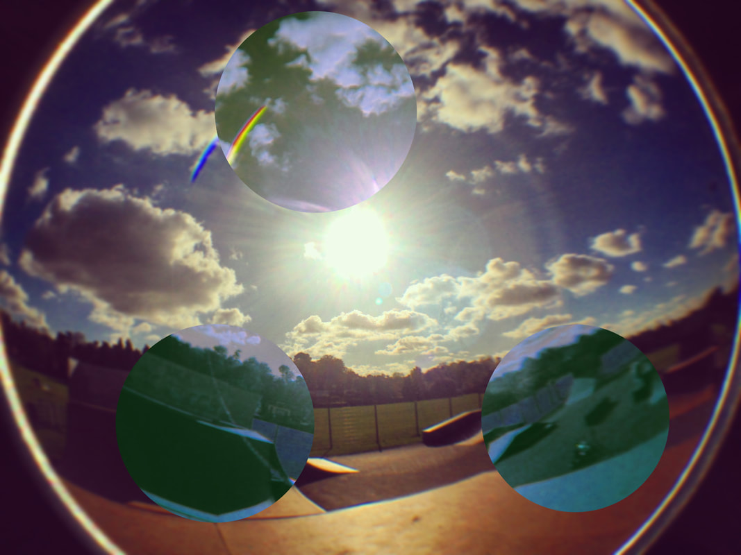
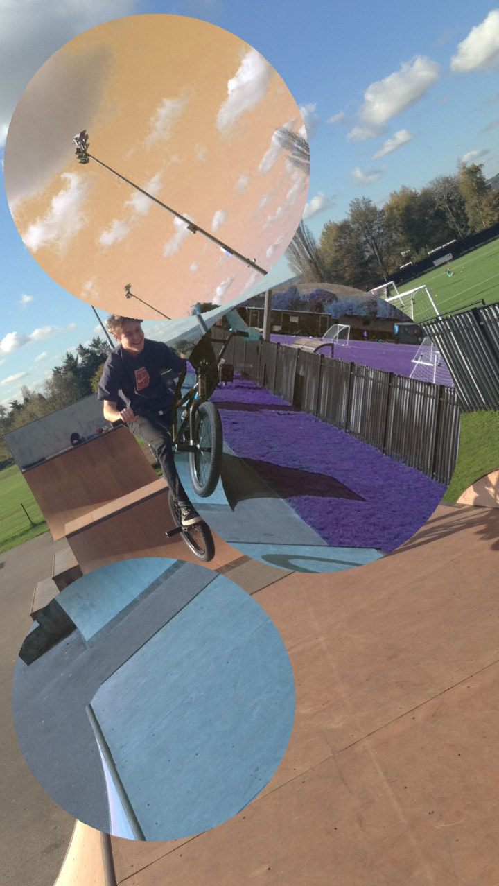
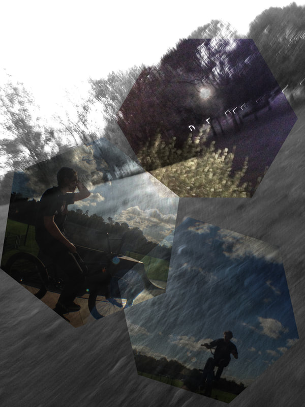
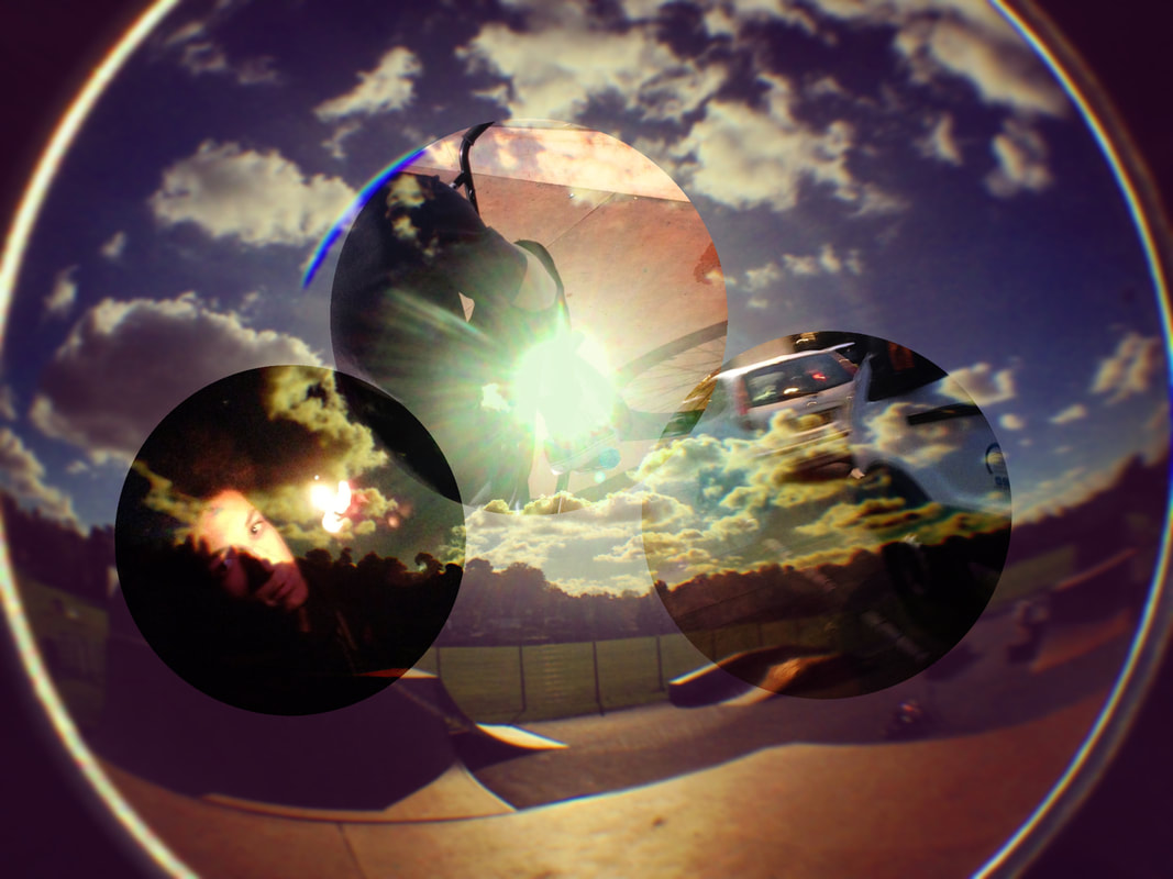
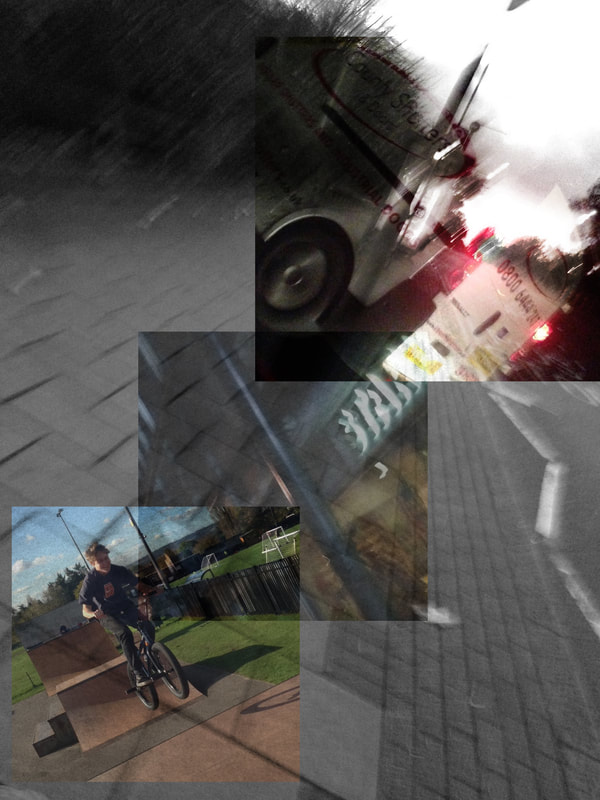
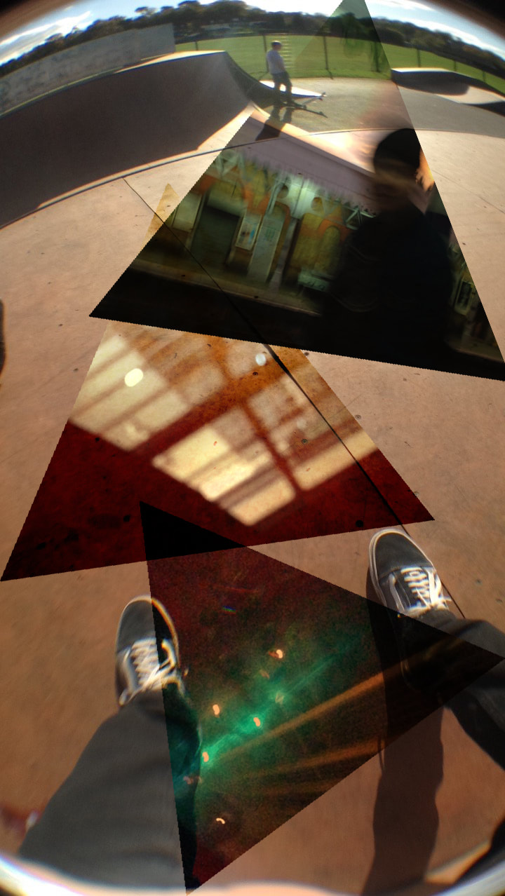
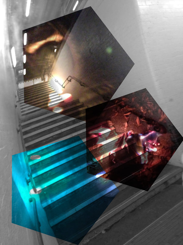
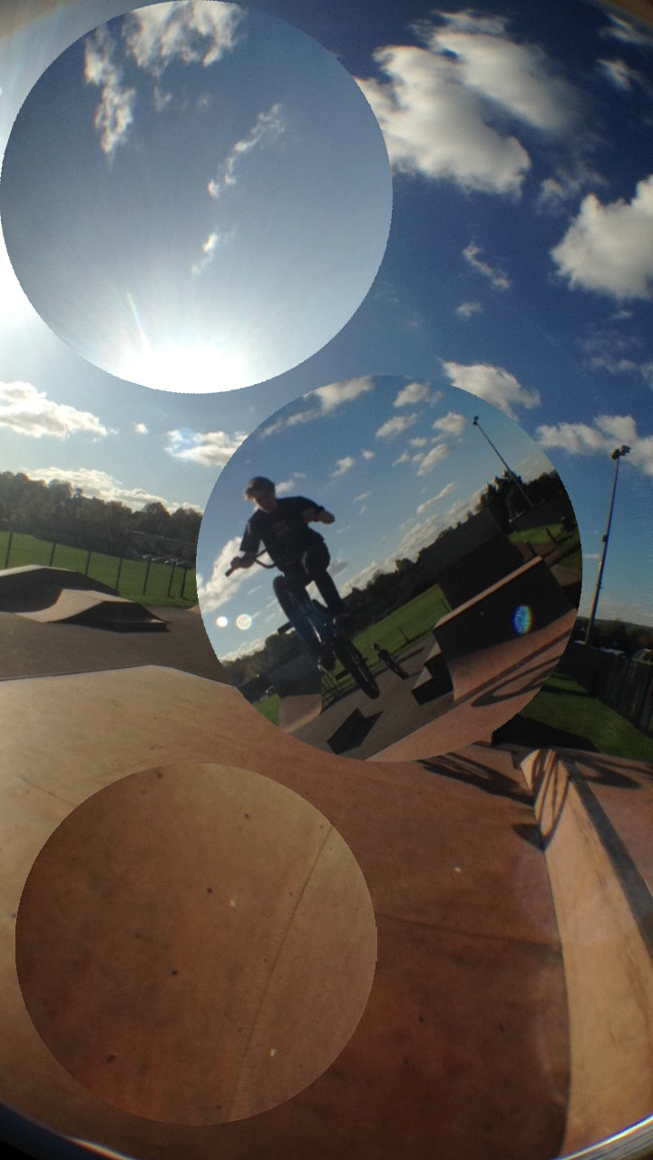
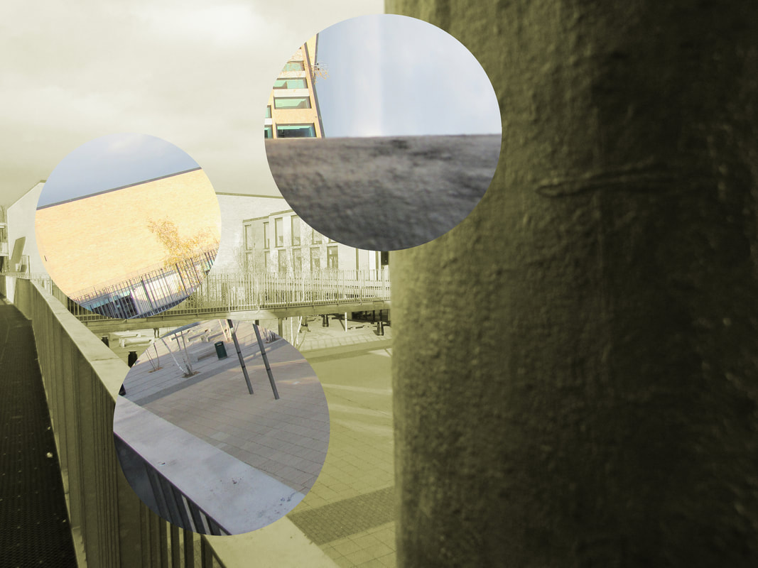
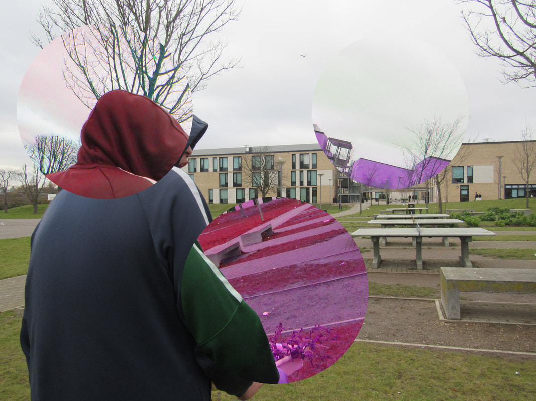
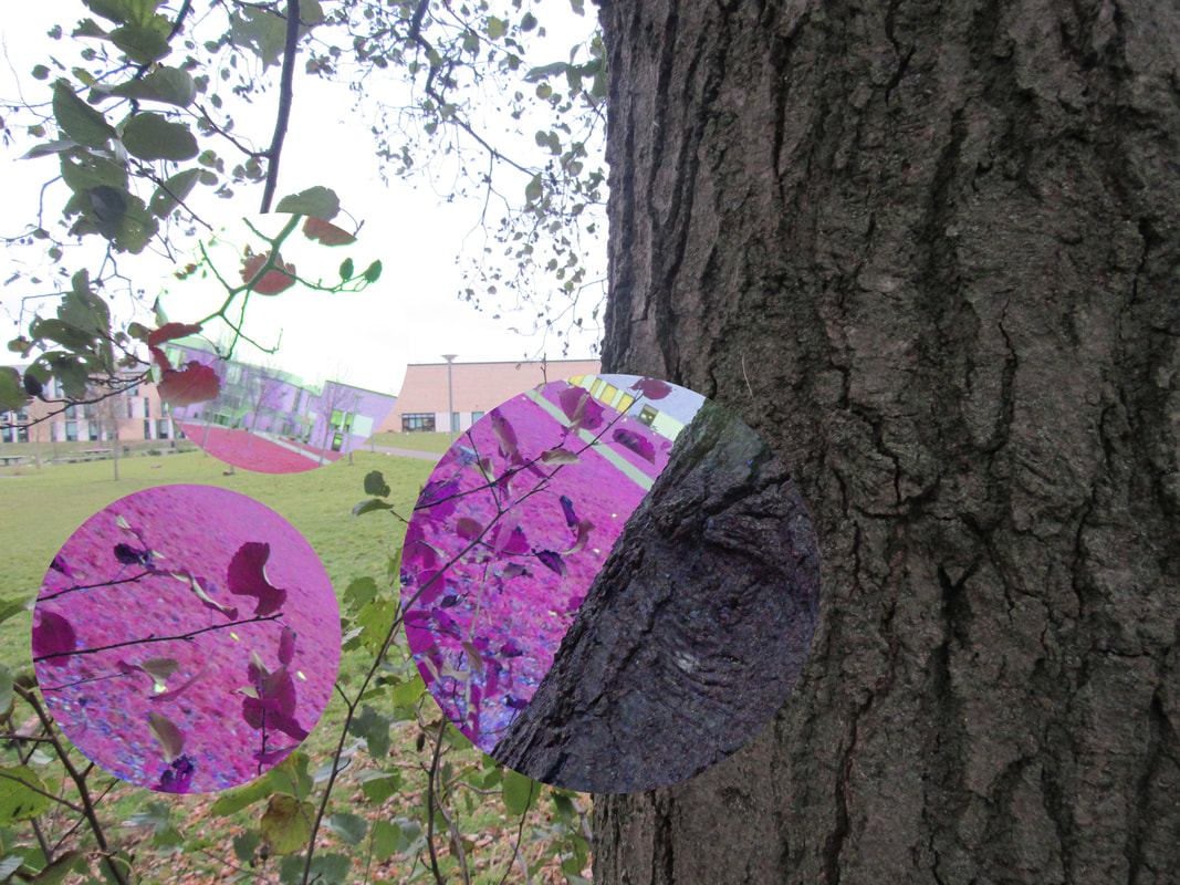
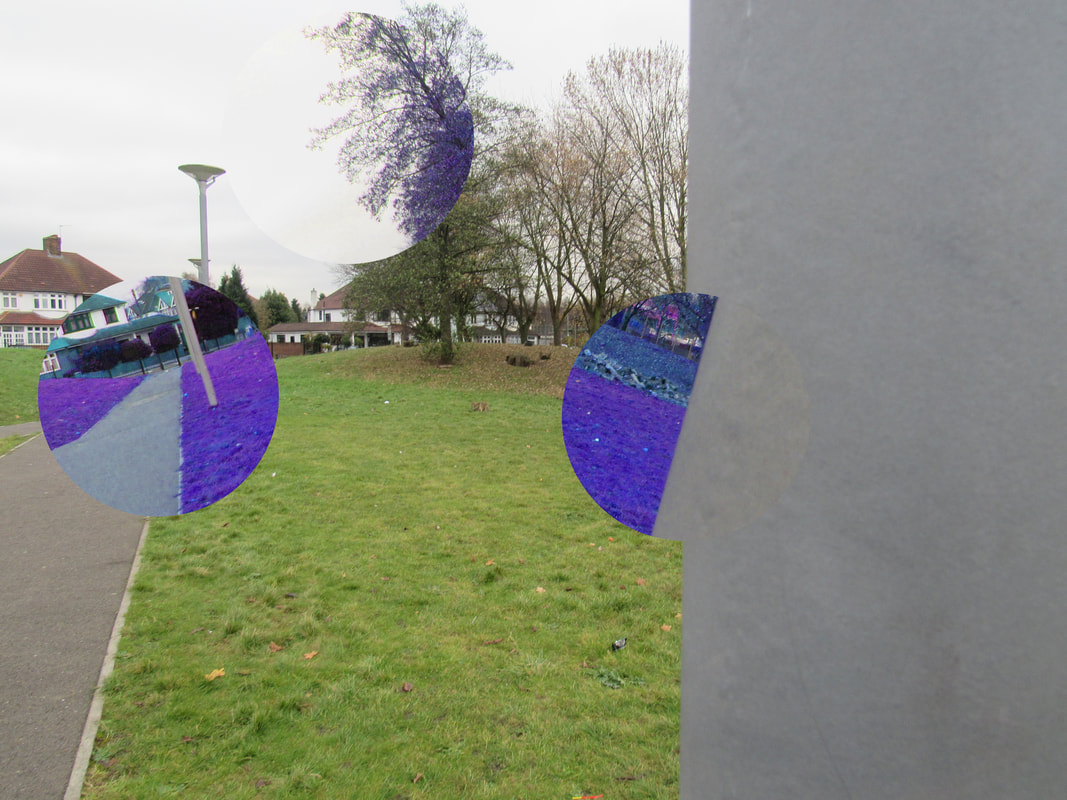
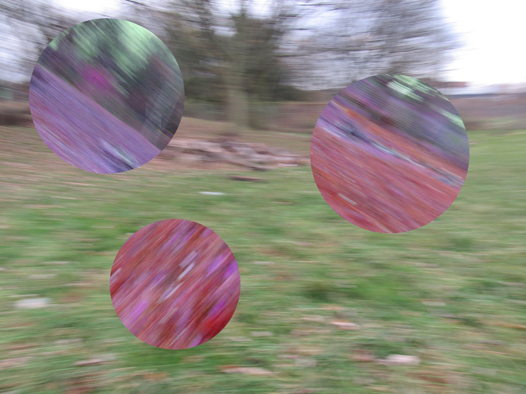
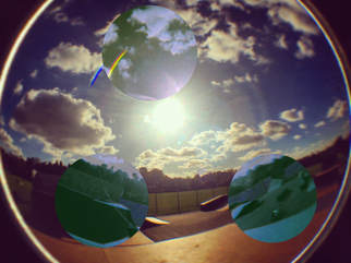
In this experiment I decided to do the same technique that I did for the las experiment except this time, I only used photos form outside of school at the skatepark. Out of school photos are much more interesting because there is a lot more things to take pictures of meaning that it's not as restricted to what i'm taking photos of. To make the coloured parts blue I set the hue to -180 from the original hue and it made most of it blue or purple other than the sky which turned slightly yellow. The main thing I like about doing it this way is that the stronger colours, like black and white, stay the way they are. This helps to show that the rotated, coloured sections are from the same original photo.
For my final piece, the main artist I took inspiration from was Lucas Simões. My and his photos look quite different but some of the details are similar especially the changing of the colour. I found Simões through the Tallis GCSE Photography website and the Pinterest. I have learned that even if the image is distorted or not very clear it can still be an amazing photo.
In all the experiments I did I changed it quite a lot throughout the entire project, sometimes it was simple changes such as using photos from a different place or sometimes it was a bigger change such as using a single picture instead of multiple. In the end I stuck with using a single photo as the base layer with coloured parts that have been rotated and another photo on top with the overlay effect and a low opacity so that you can see everything but it has an interesting effect on it. The only part about this project that I found challenging was thinking of an idea and choosing the right photos that go well together.
For all the images I took the base photos on the route that I use to get to school because there is a lot of interesting things such as train stations and pathways surrounded by trees. For the overlay layers I used a couple different techniques to make the images more interesting. On two of them I just used a normal camera to take the photo and then I placed it sideways on top of the base layer and the rotated layers. On the other two I used a fisheye lens that attaches to my phone to take the photos and I like these because it add a circular shape around the edge of the images which fits into the rest of the image because I used rotated circular section of the base layers. The photos are quite bright and I used vibrant colours of the rotated sections because I feel as if brighter colours look better because it makes the image more clear. I was hoping to create something that was slightly abstract but fit into the fragments theme as well as it being clear what the image is of. I think it worked but if had more time I would try and used different techniques for the overlay layers to see if it would look any better. I think I successfully explored the theme of fragments because I experimented with a lot of different techniques to get the best piece I could do within the allowed time. It's personal because I walk the same route nearly every day because it is on the way to and from school so when I look at my final piece I will know where the locations of the photos are because they aren't a random place that I took a photo of. I hope that the people viewing it will understand that it's meant to be slightly abstract so they will have to look at it properly to understand what is happening in the image instead of just giving it a quick glance.
